Diving into the Guidelines:
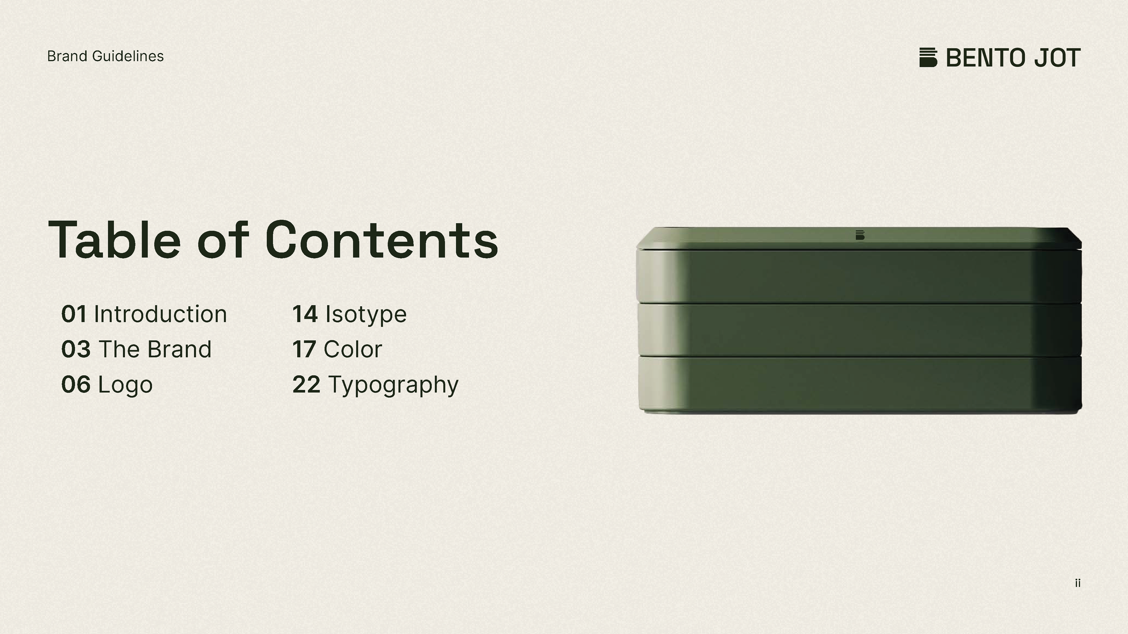
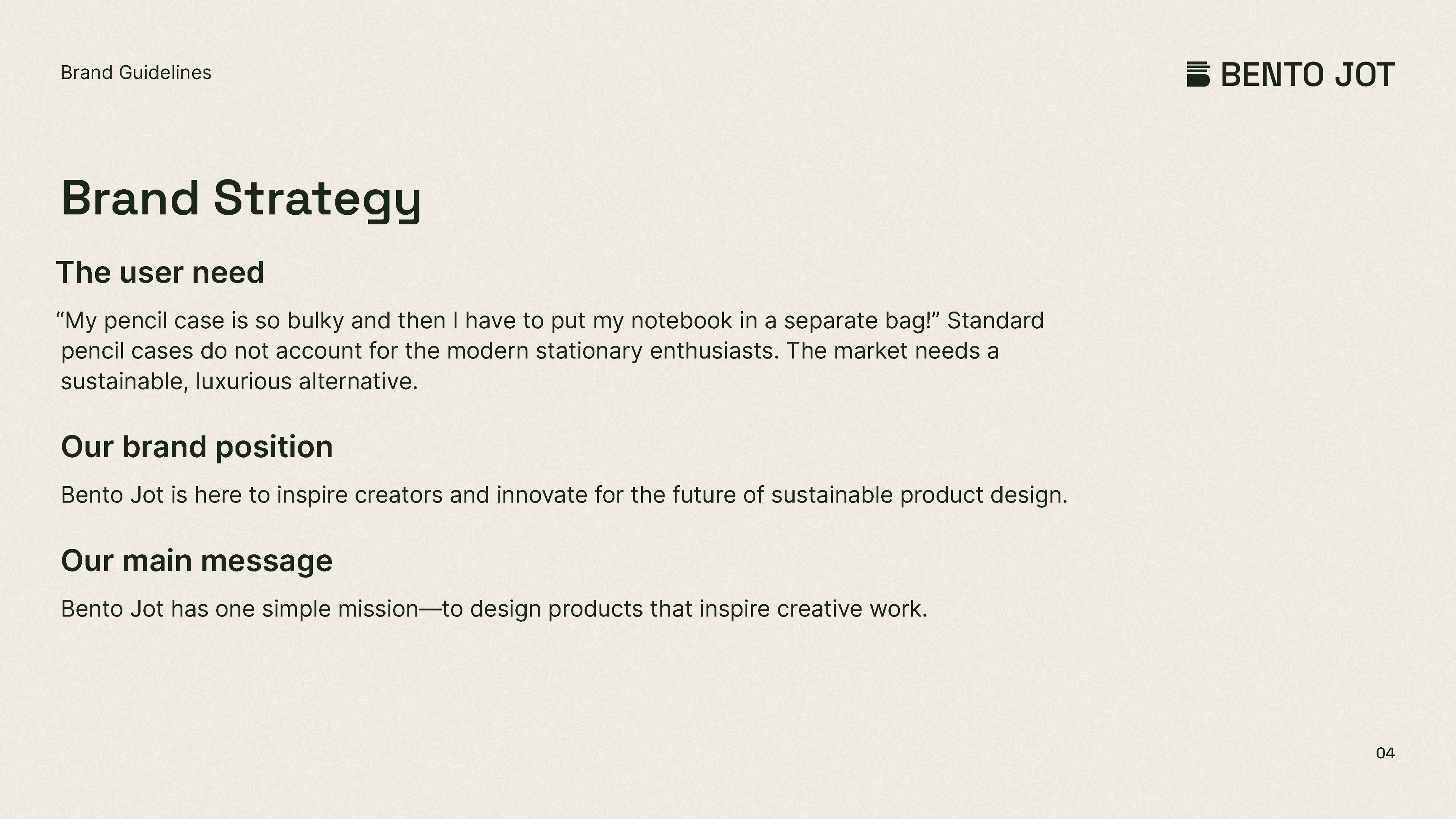
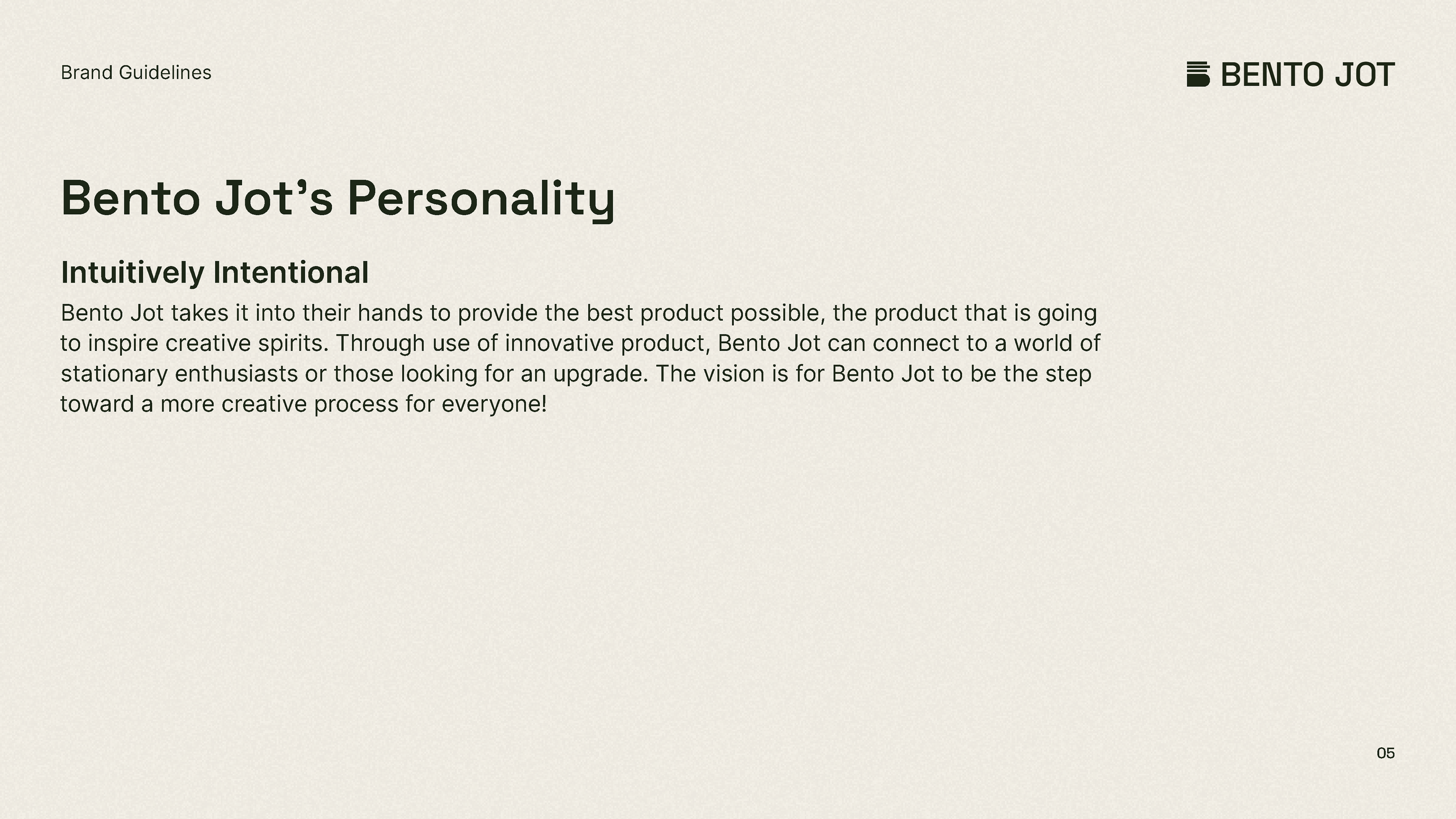
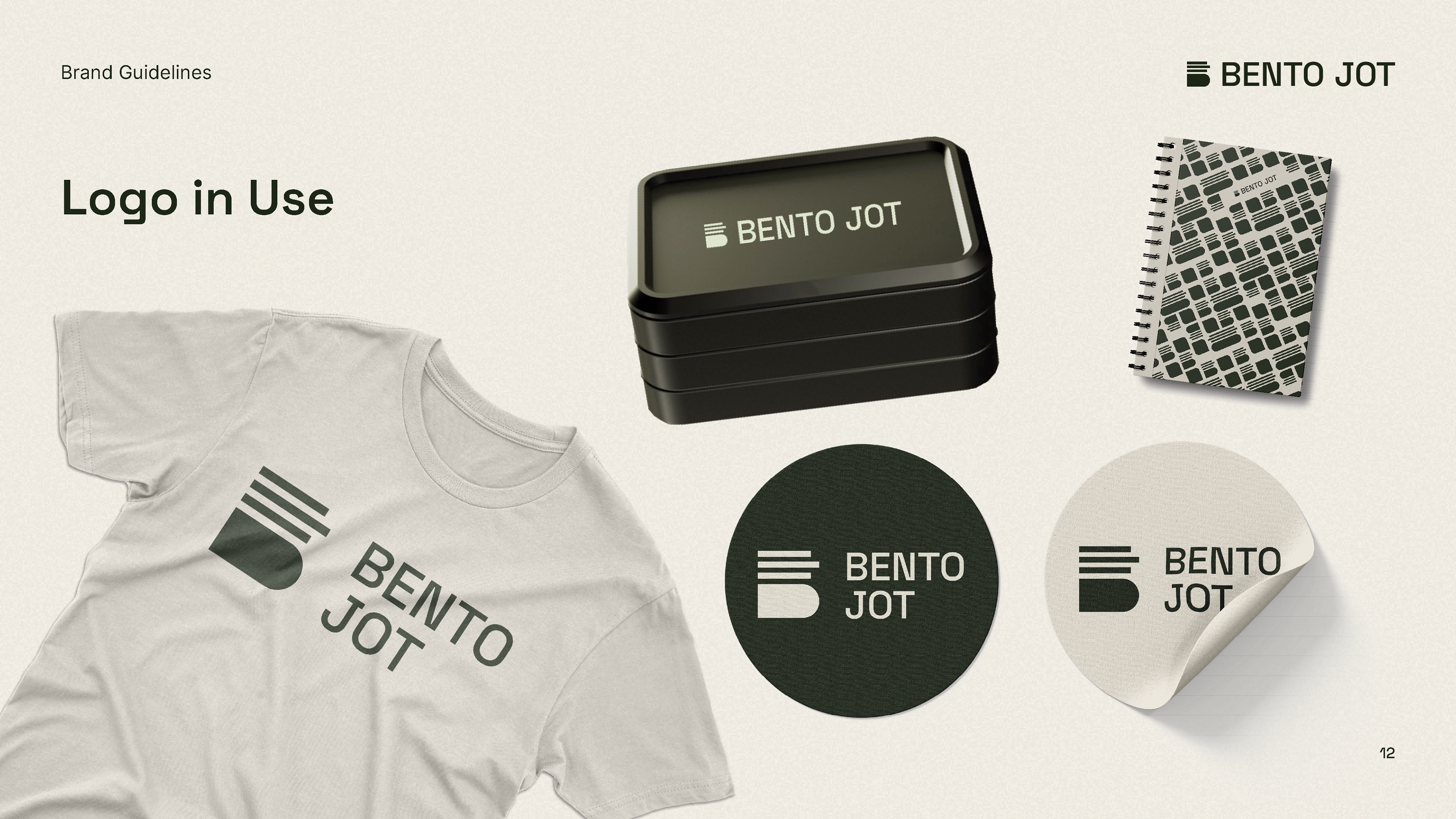
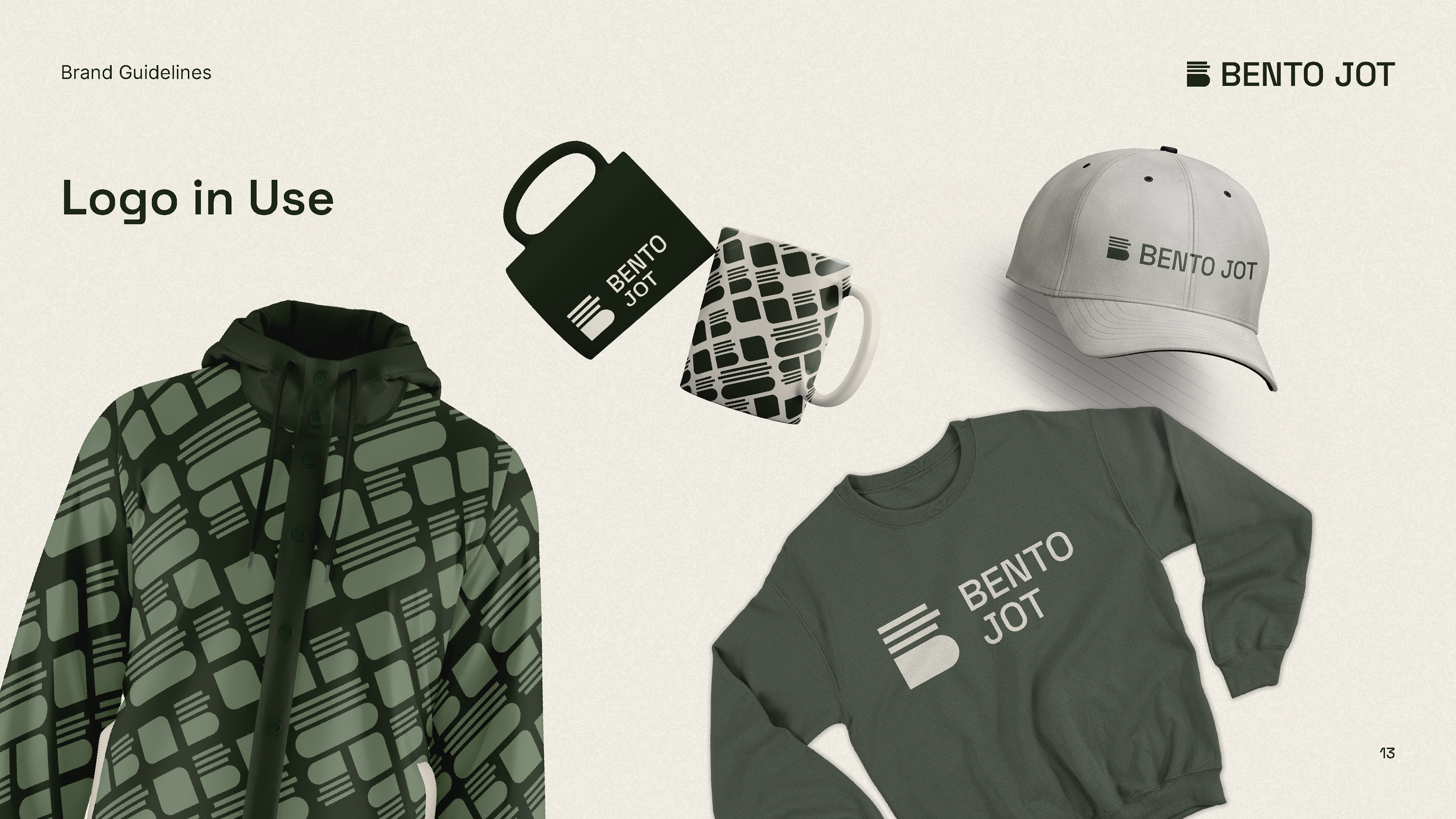
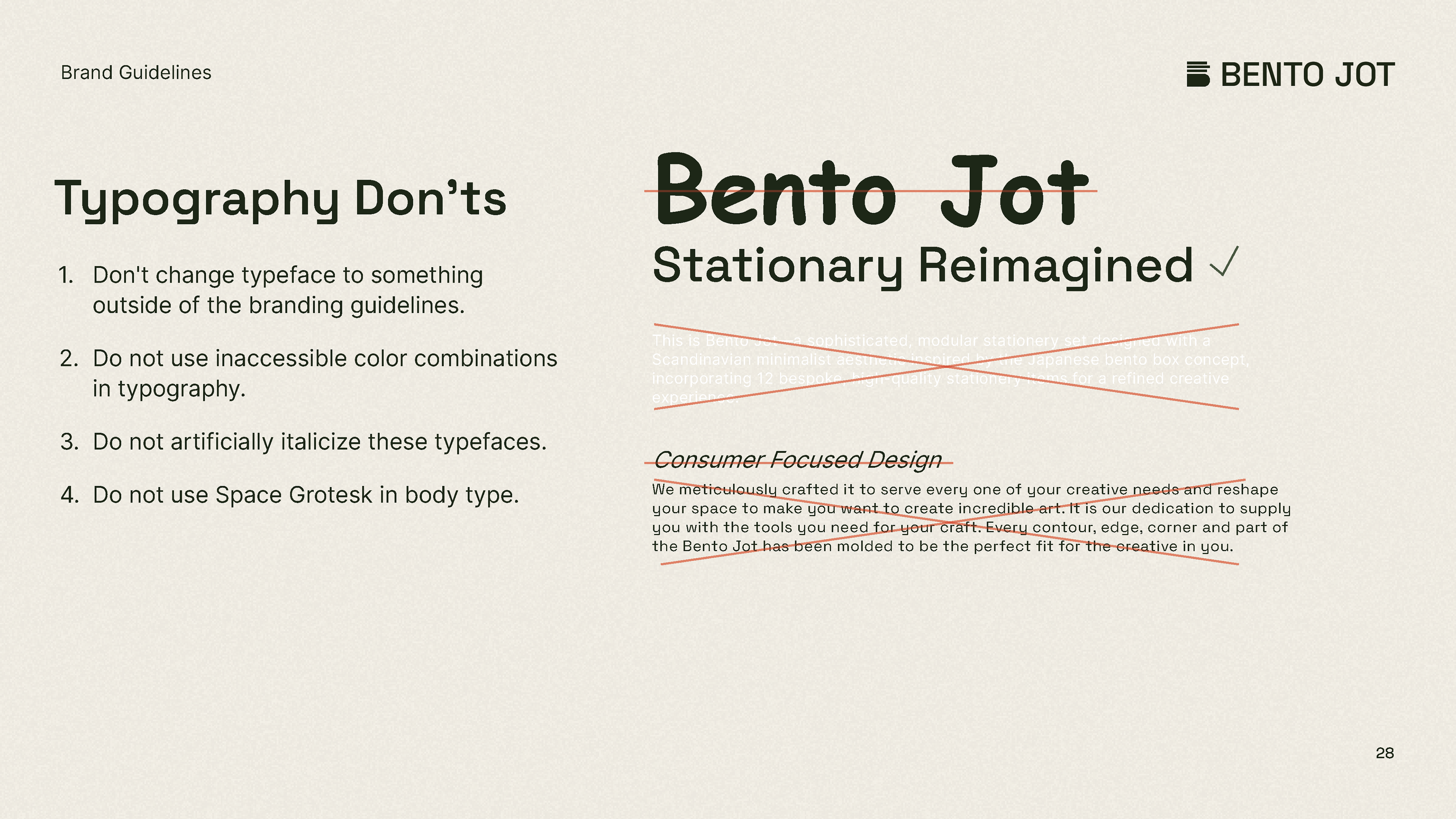
I produced by myself, an entire collection of guidelines for Bento Jot as an extracurricular project and the following are the results. I examine a lot of different ideas within this guide, which required a lot of research and time dedicated.
Website:
The Bento Jot website is an exploration of Figma's mechanics and web design. It uses Noise, gradients and real product images to produce a textural and modern feel. It is a one-page design, so no need to look any further.


Taking Inspiration from Product Models:
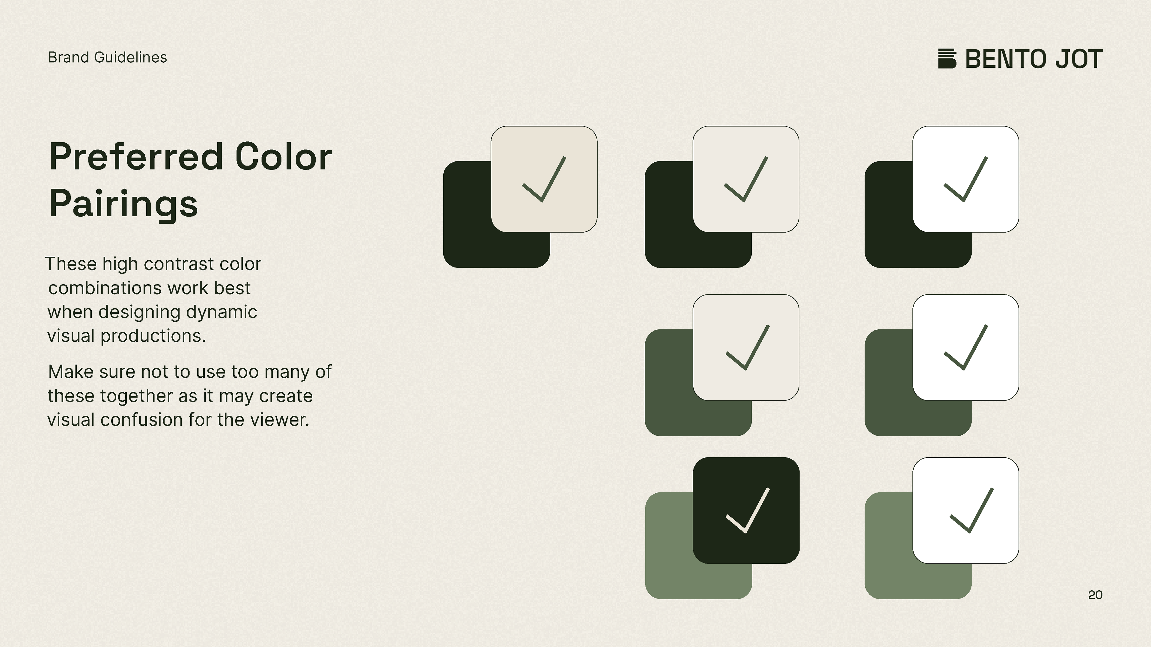
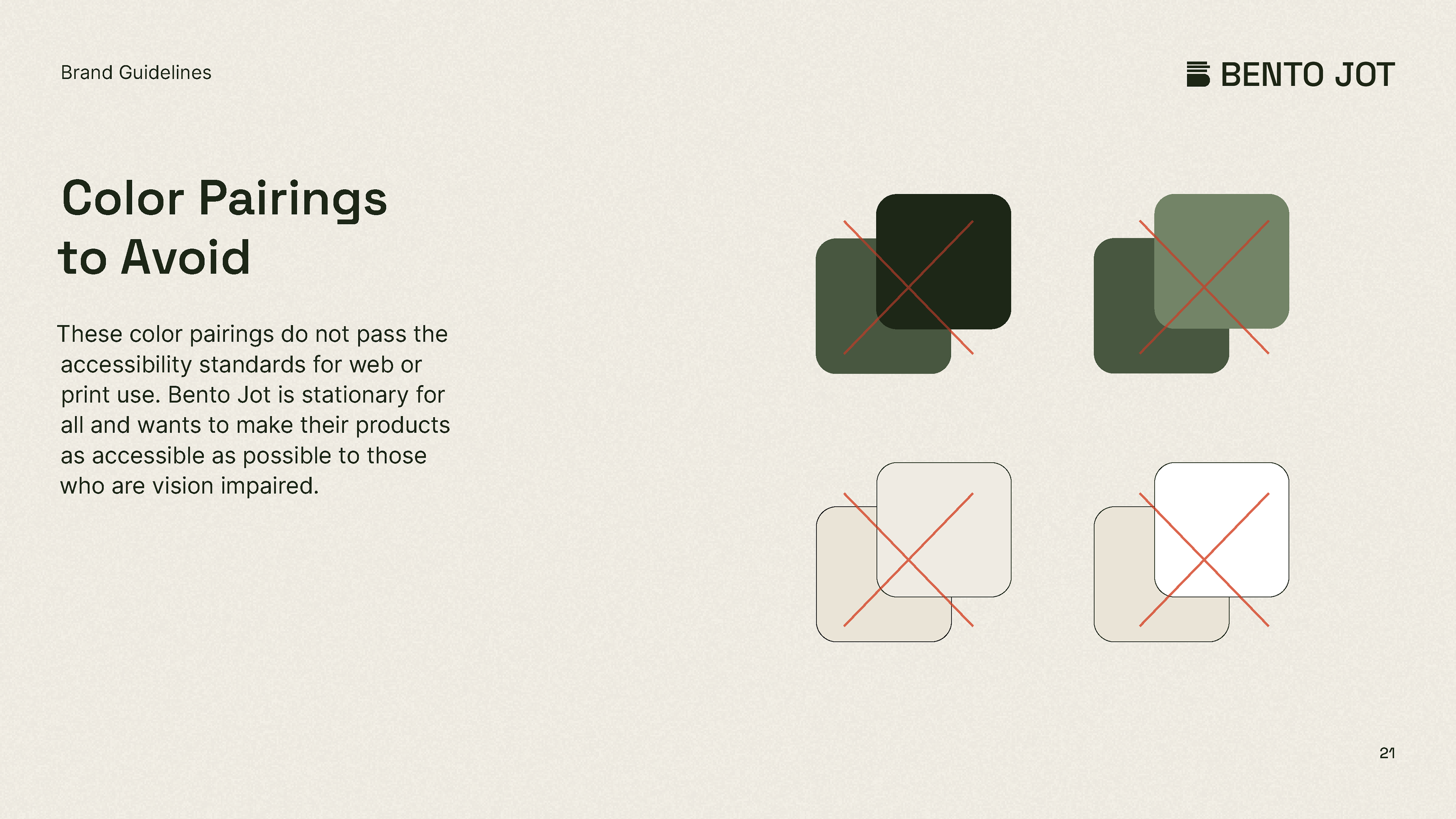
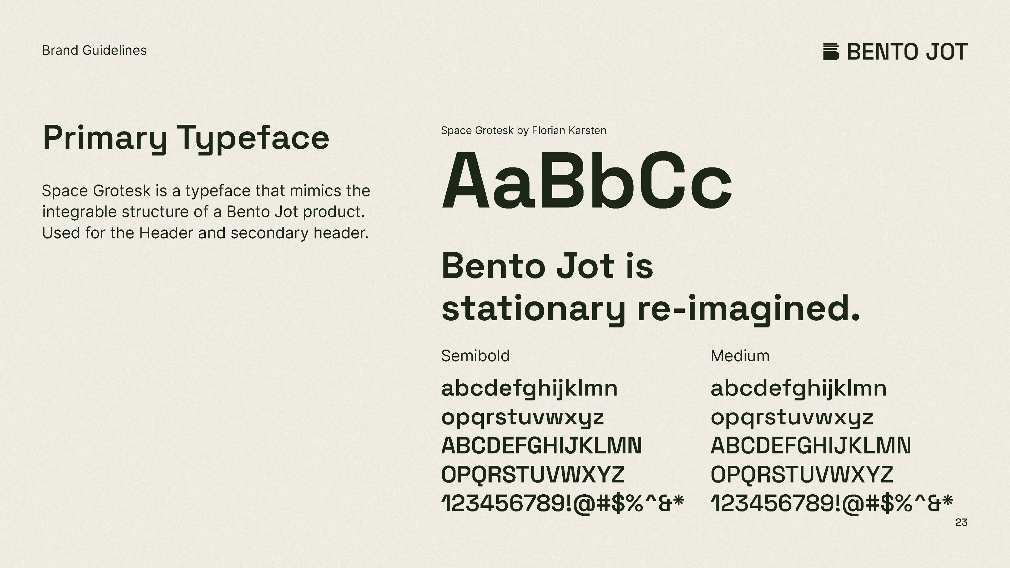
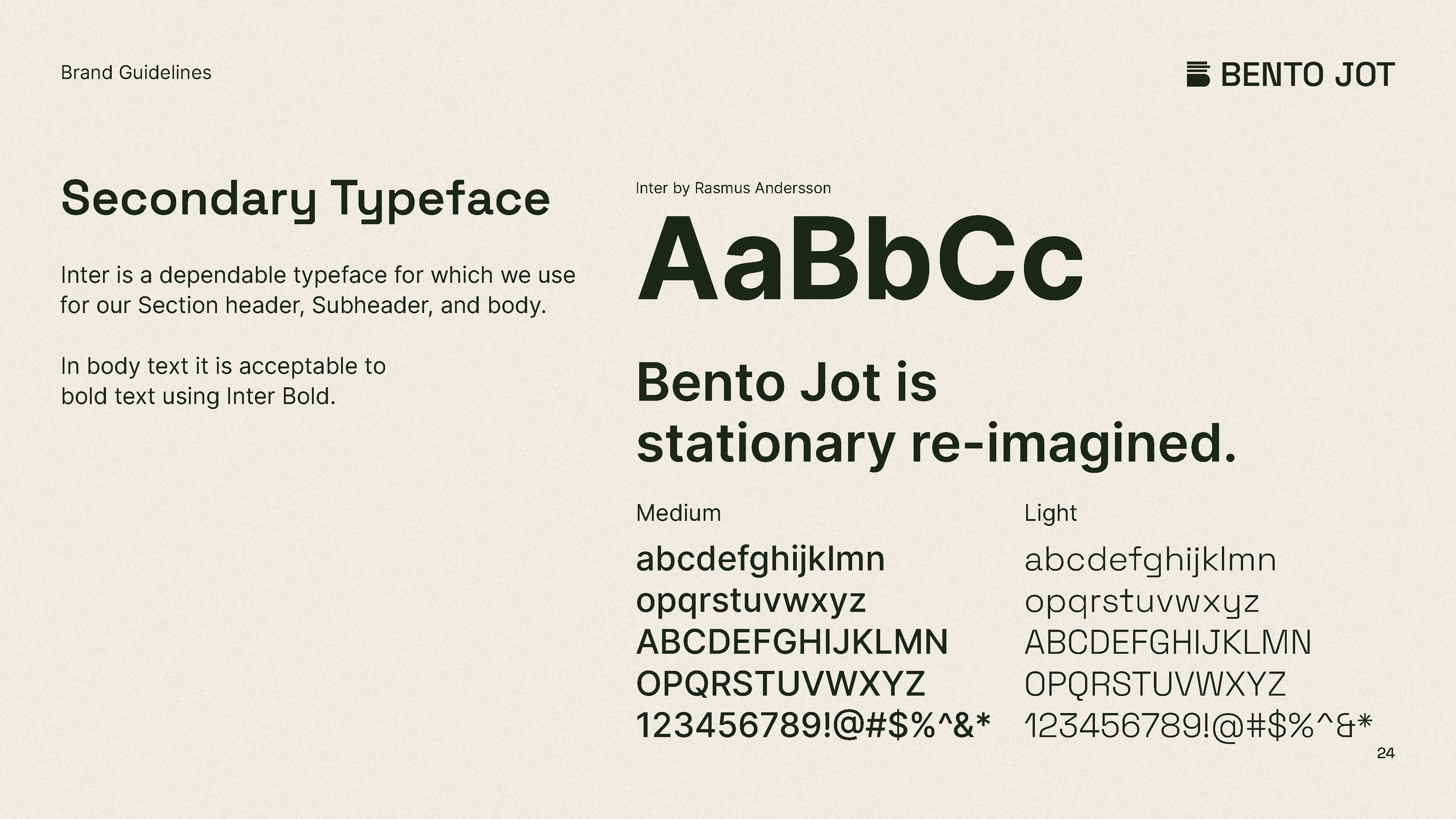
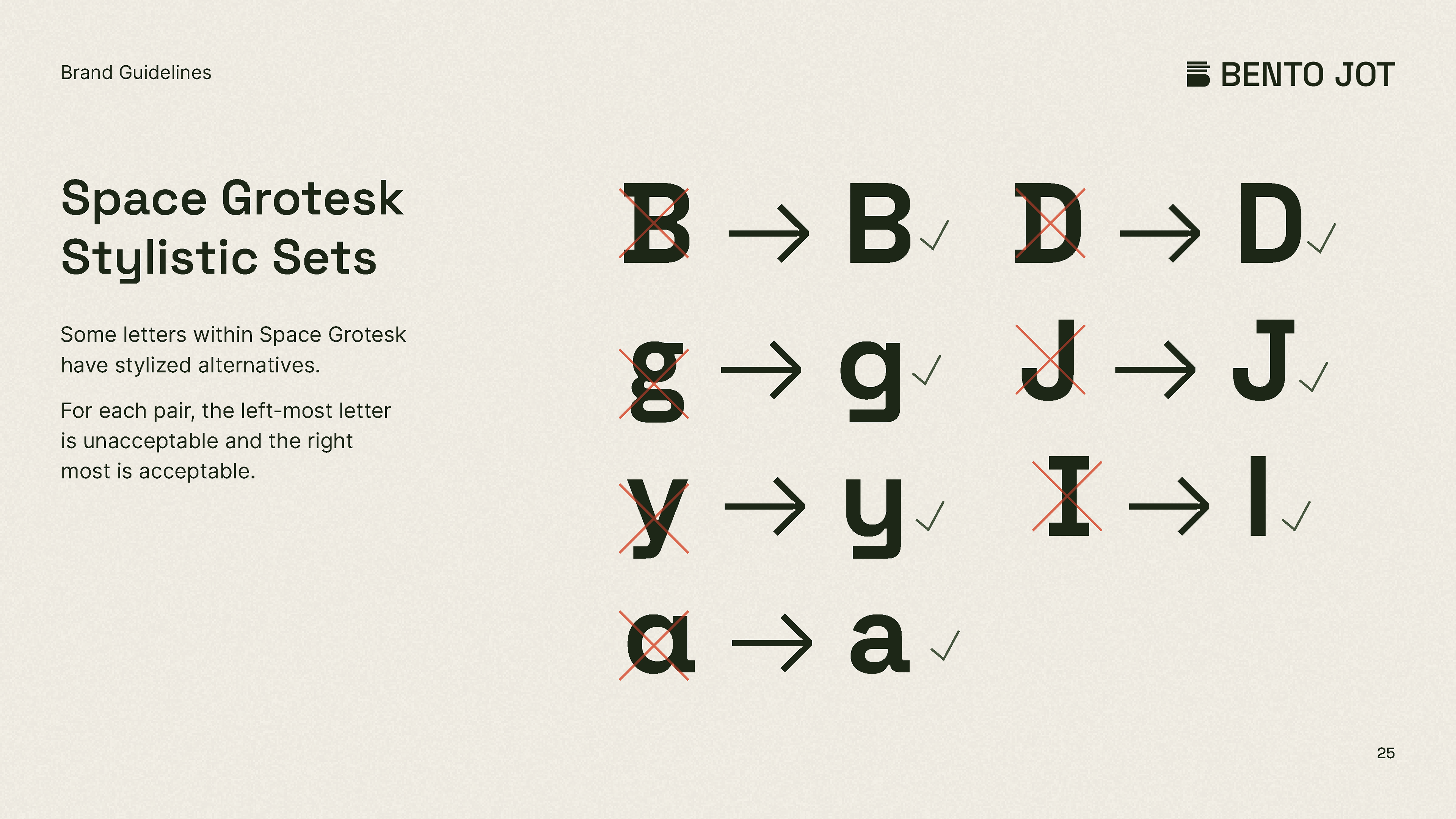
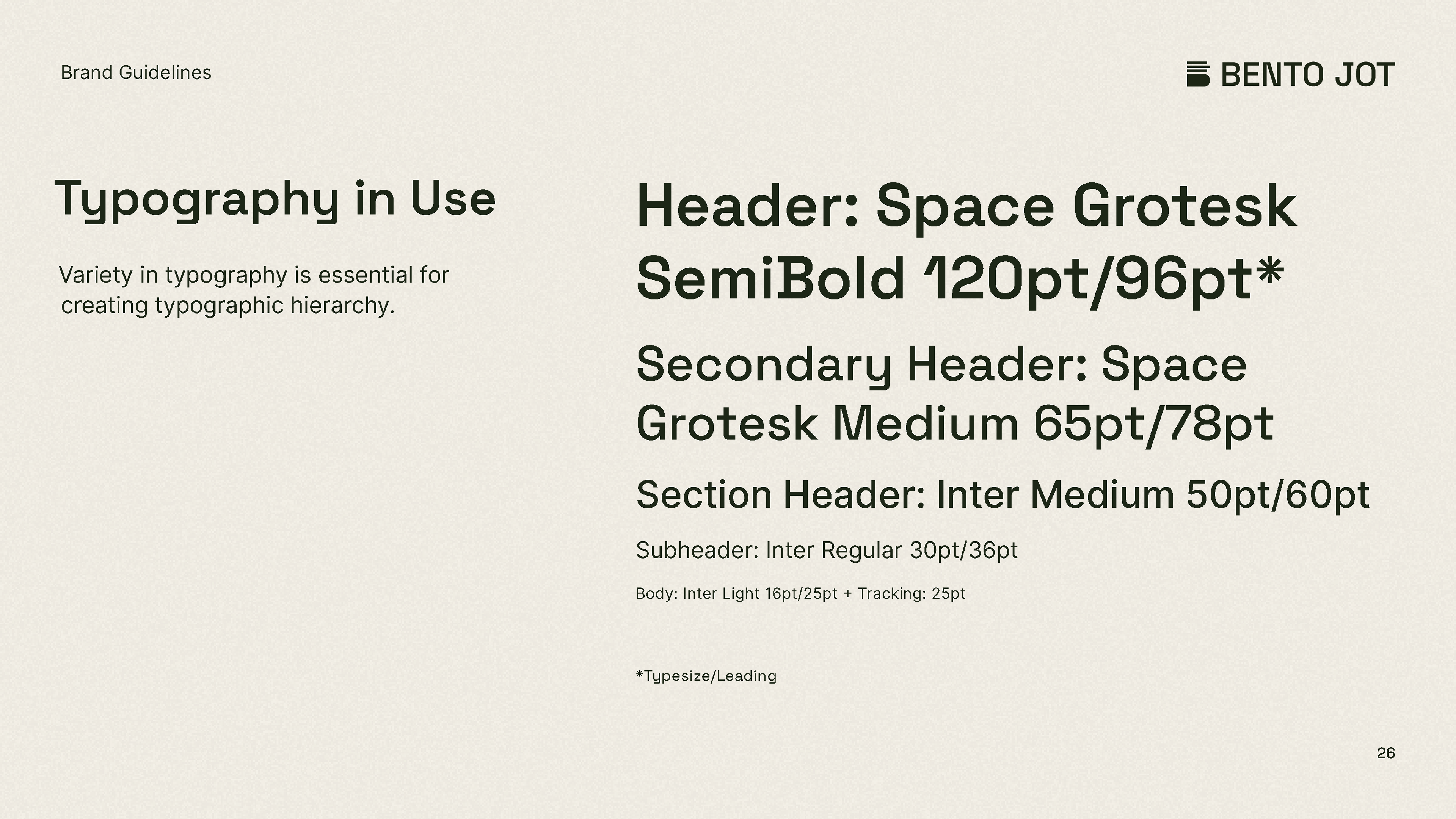
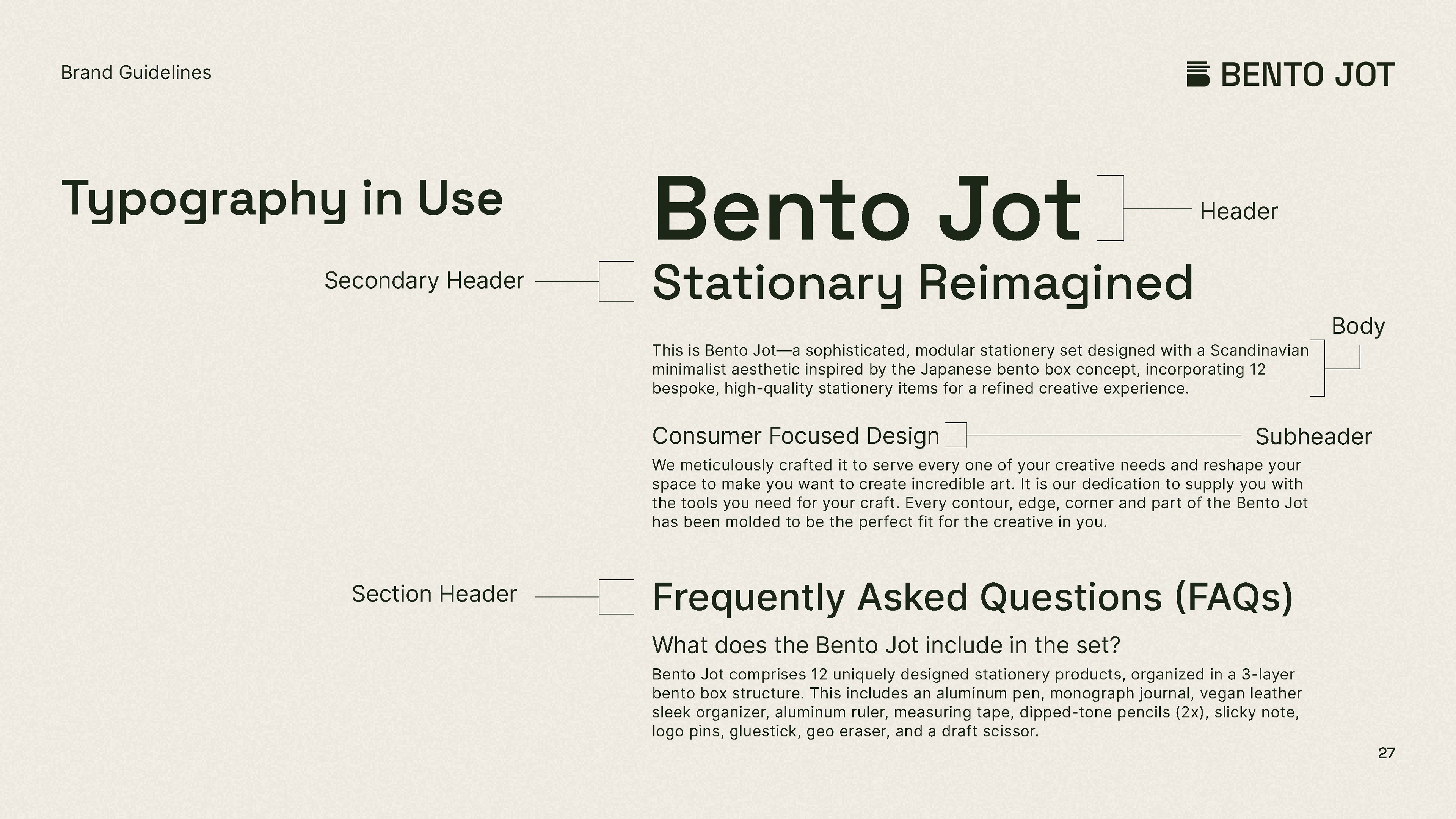
My past experience with this product (creating a one-pager for it in class) was how I collected additional inspirations in styling. Especially when it comes to typography and color.
Explorations and Sketches:
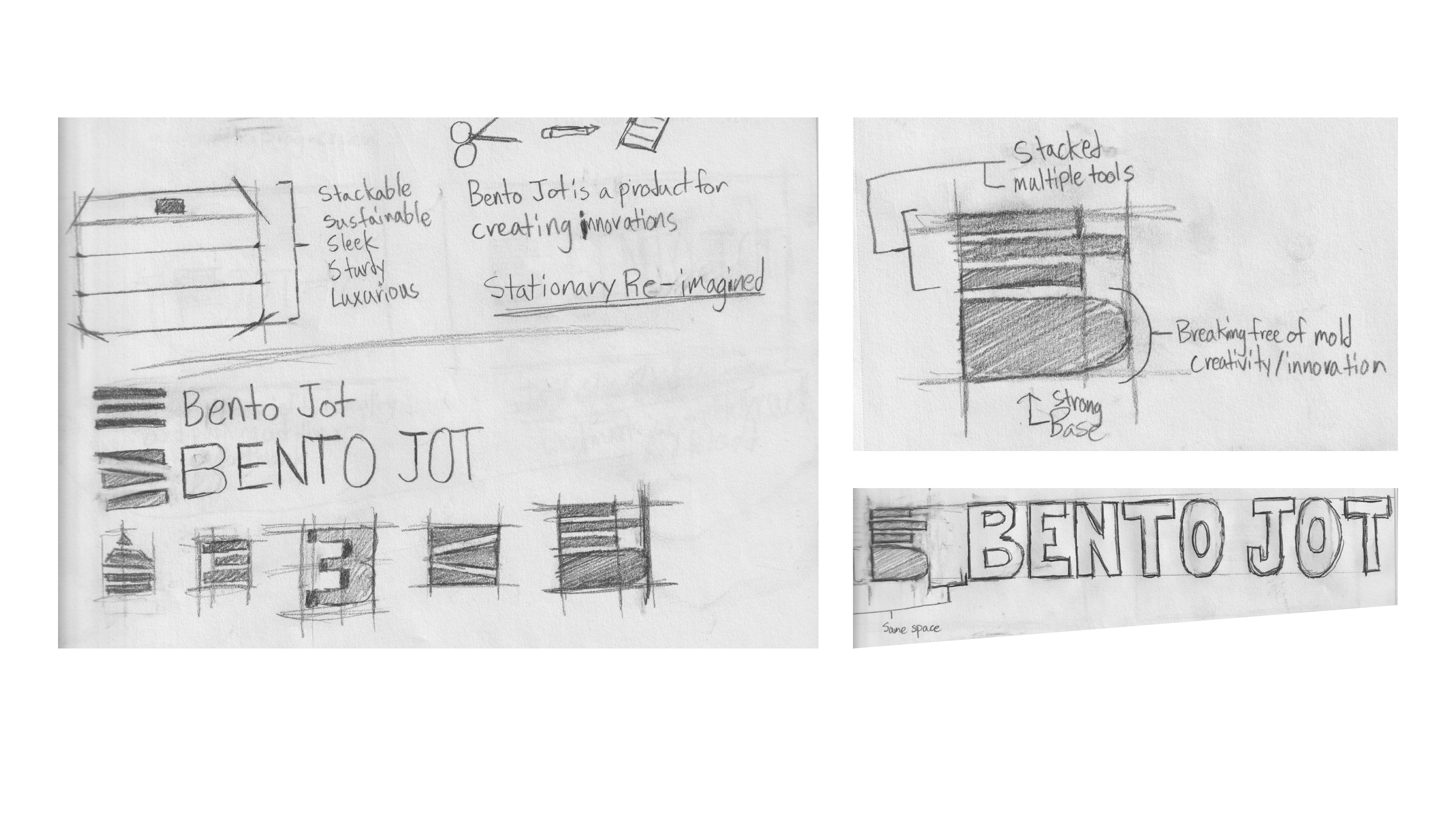
My familiarity with the product structure and general interaction with typography and color lended itself to my exploration stage. I shifted focus a lot during the process.
Finalizing and Perfecting on a Grid:
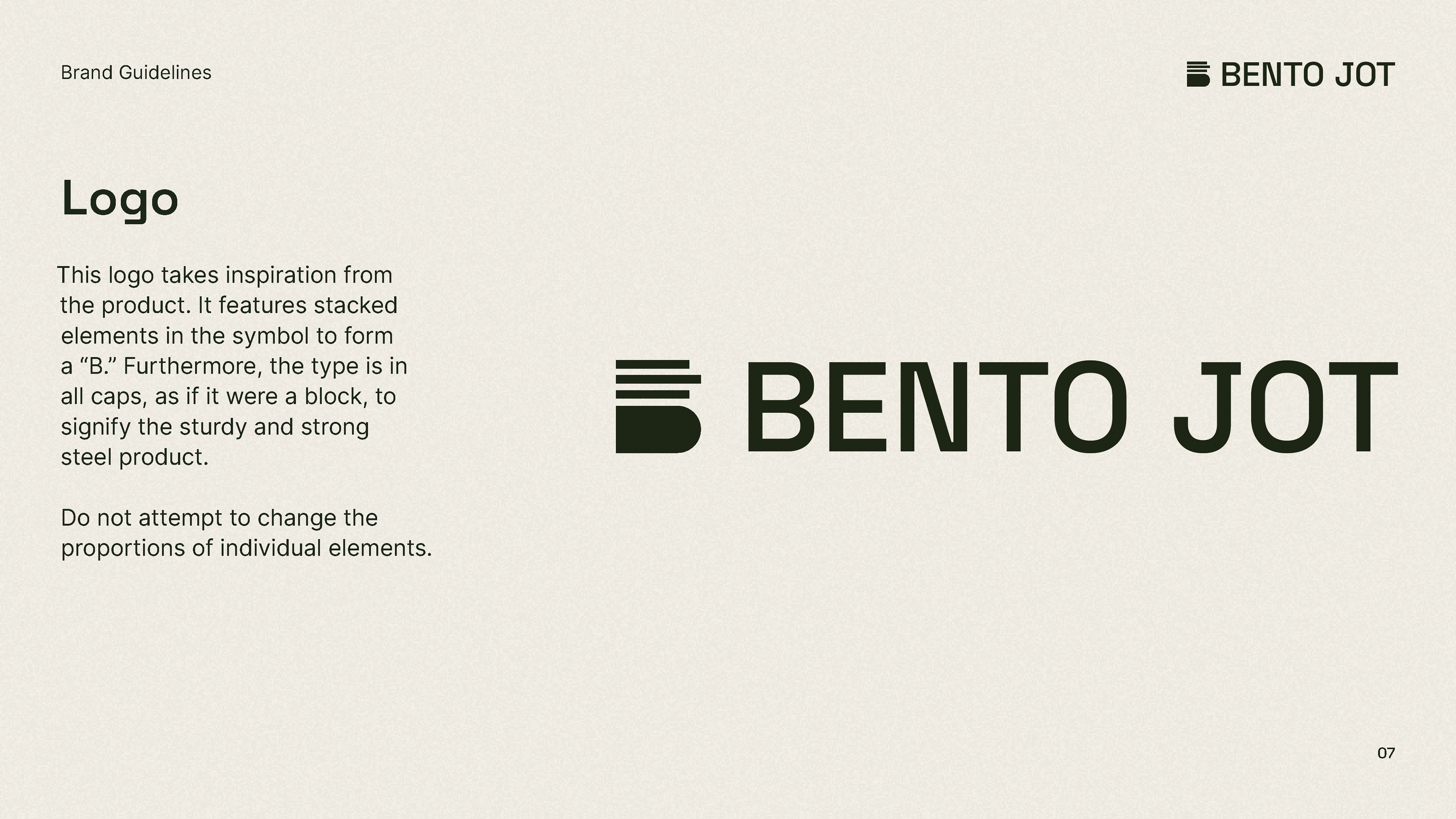
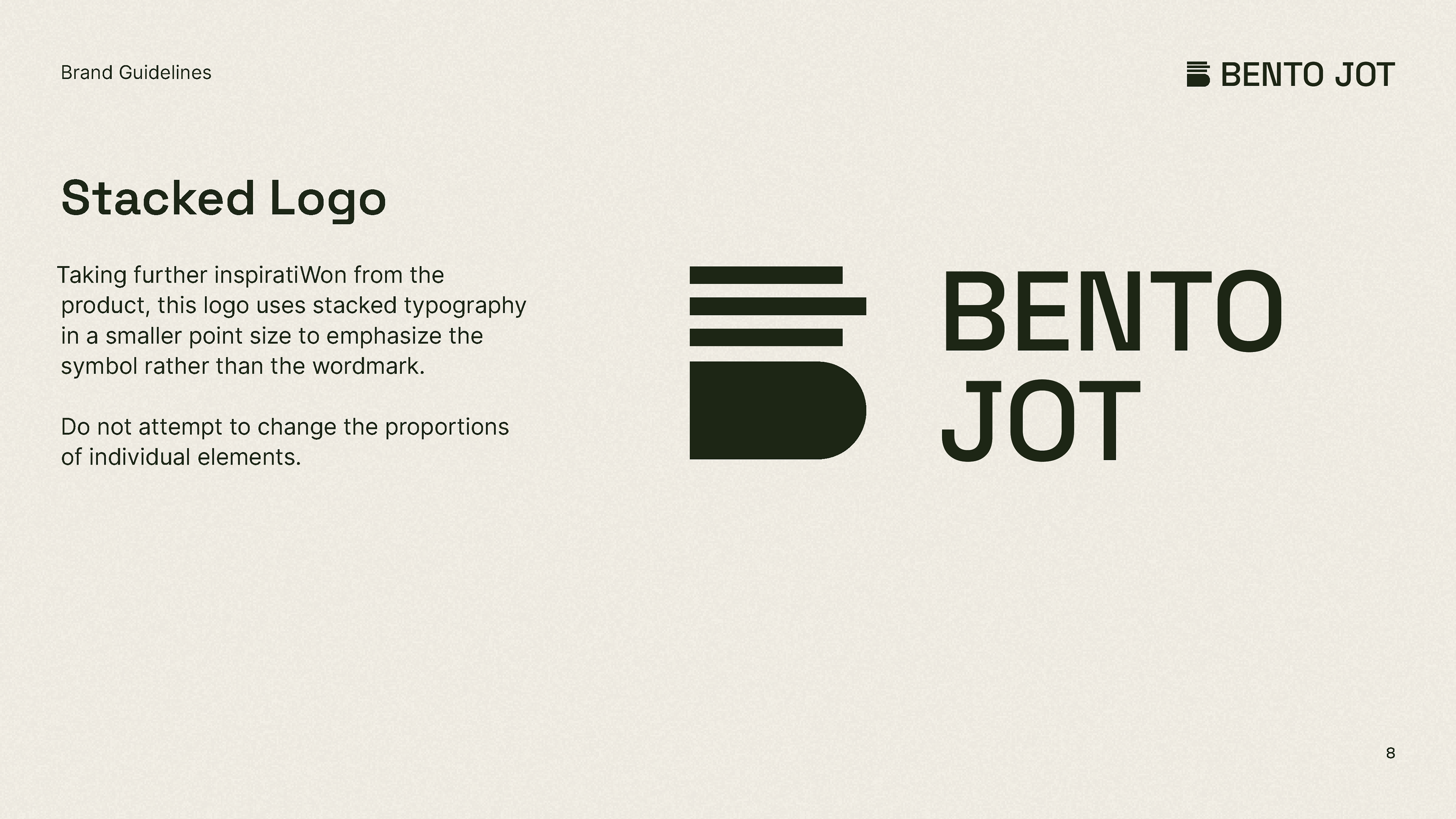
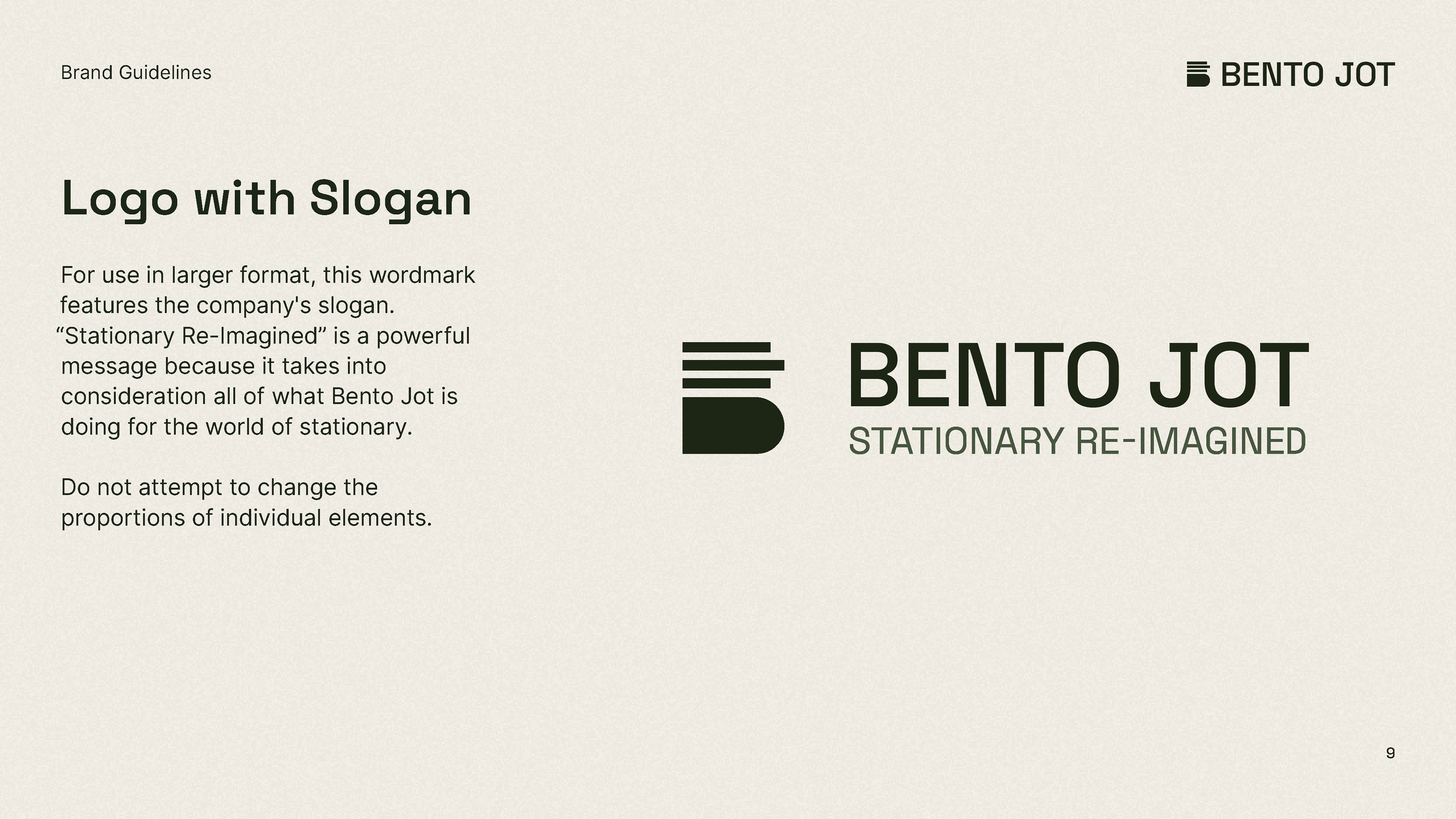
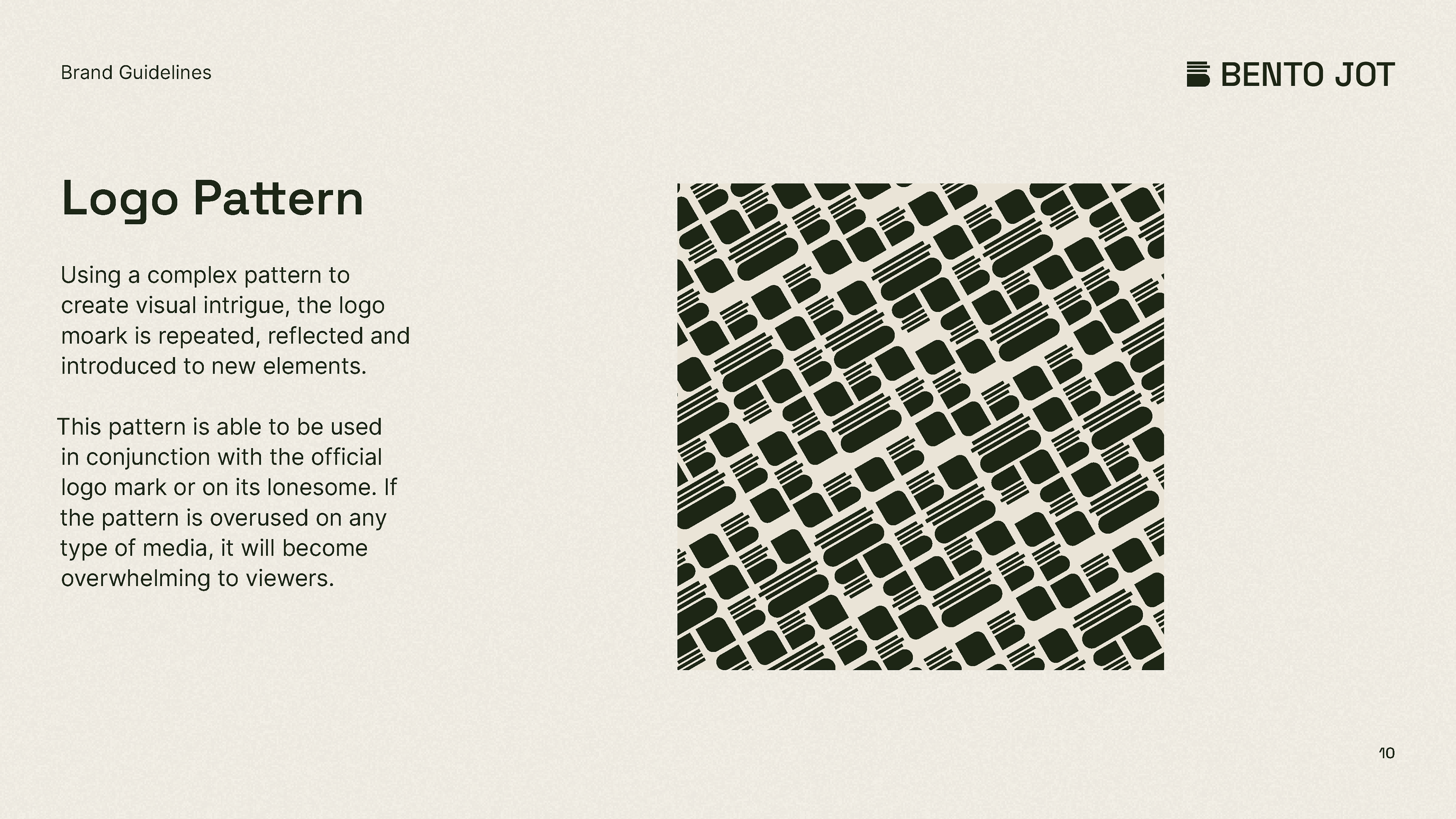
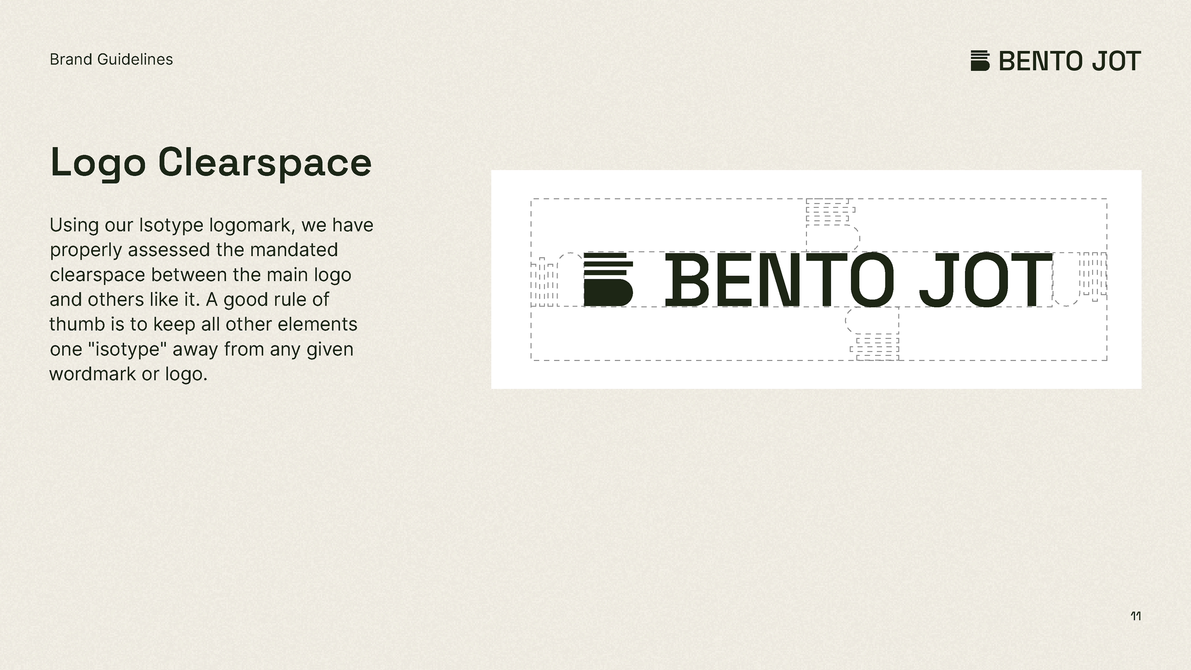
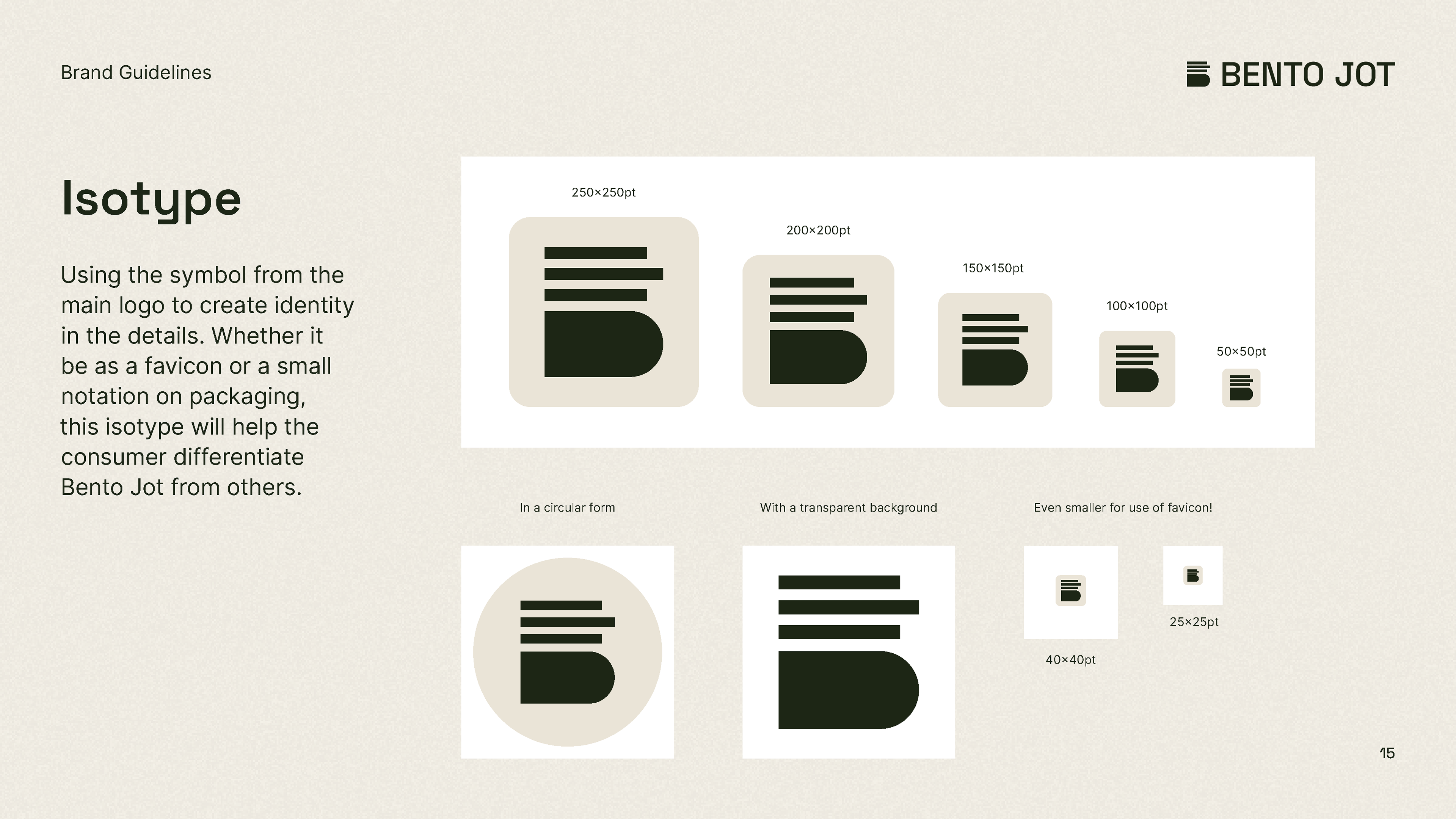
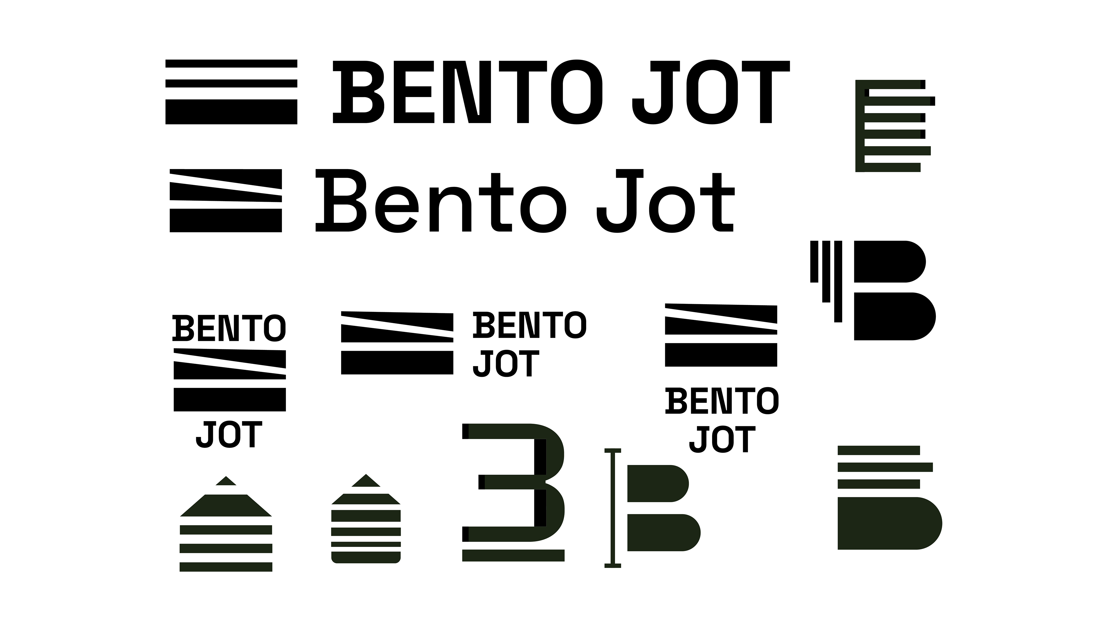
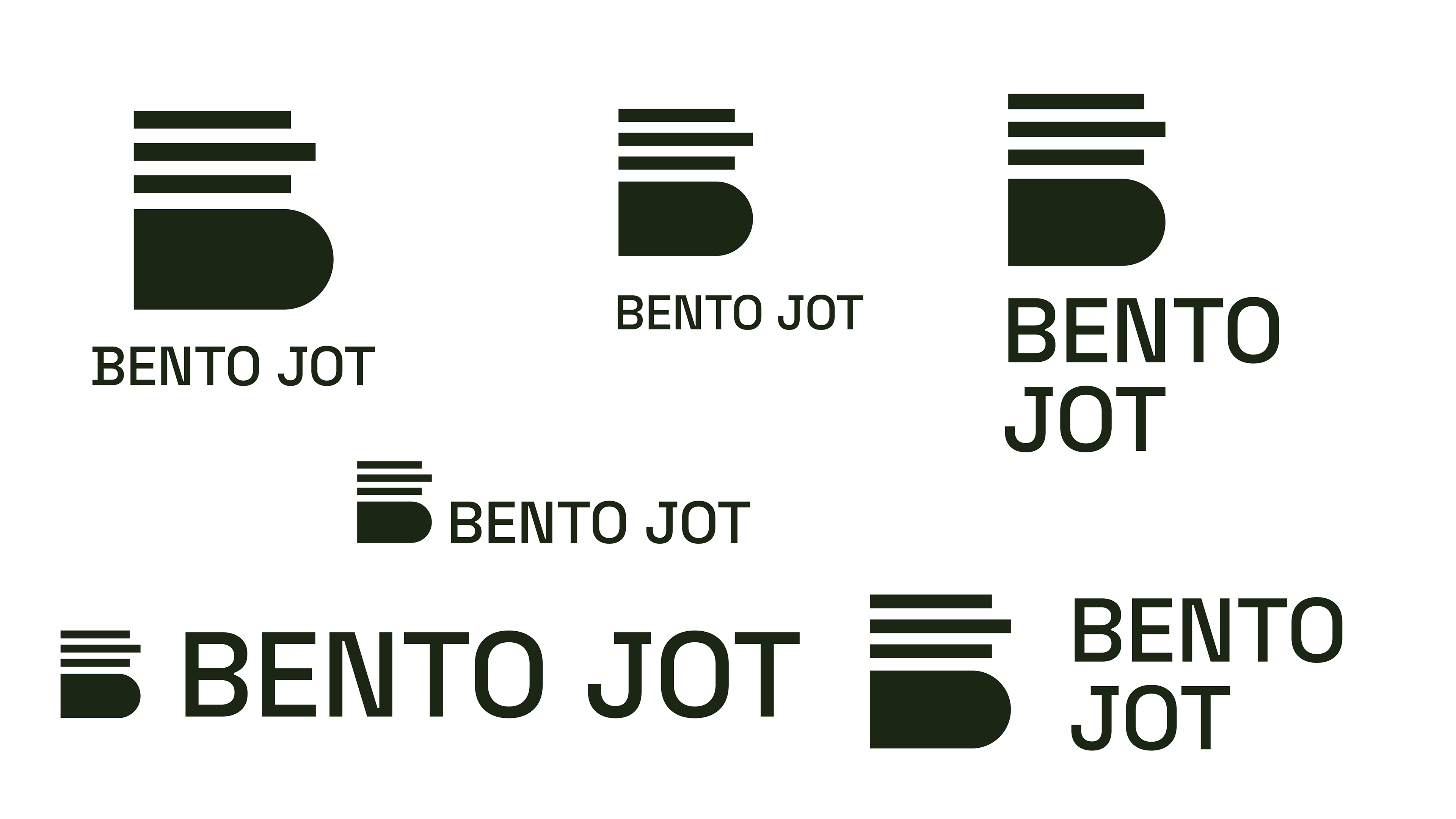
I wanted my wordmark to be strong and structured as is the Bento Jot itself. The logo is structured to be extremely minimalistic and appear to be stacked on top of each other like the product is, while also resembling the letter "B." I used elements from the logo to ensure that the wordmark in totality had even spacing.
*This project is in no way a collaboration between me and the people at Bento Jot or NOOE
