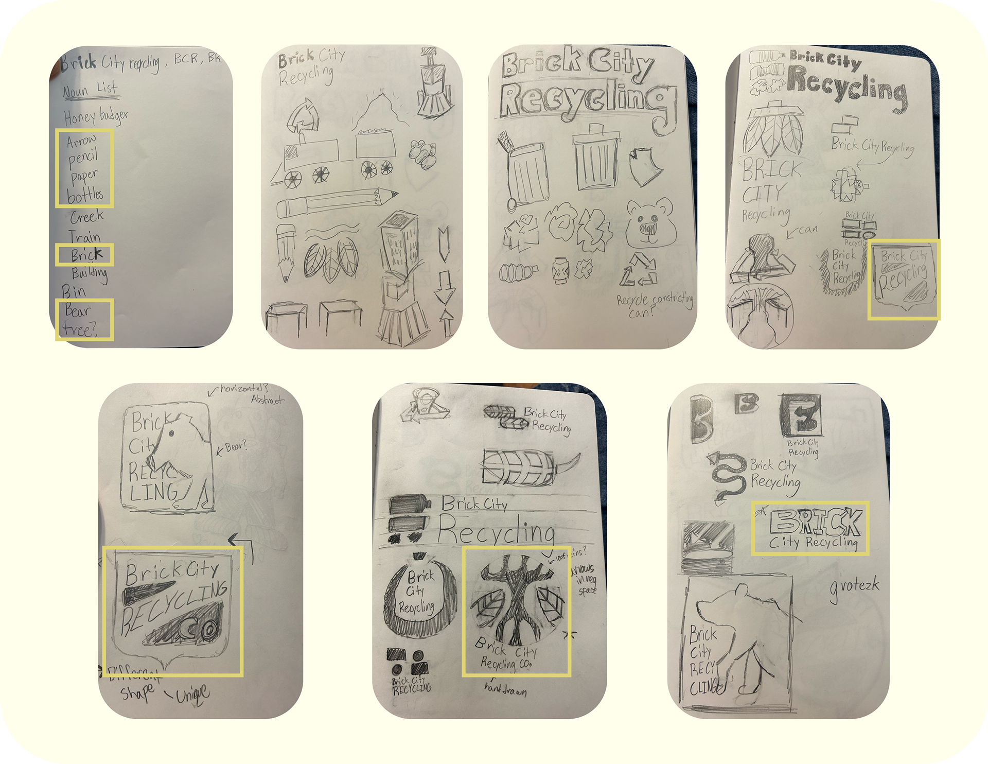
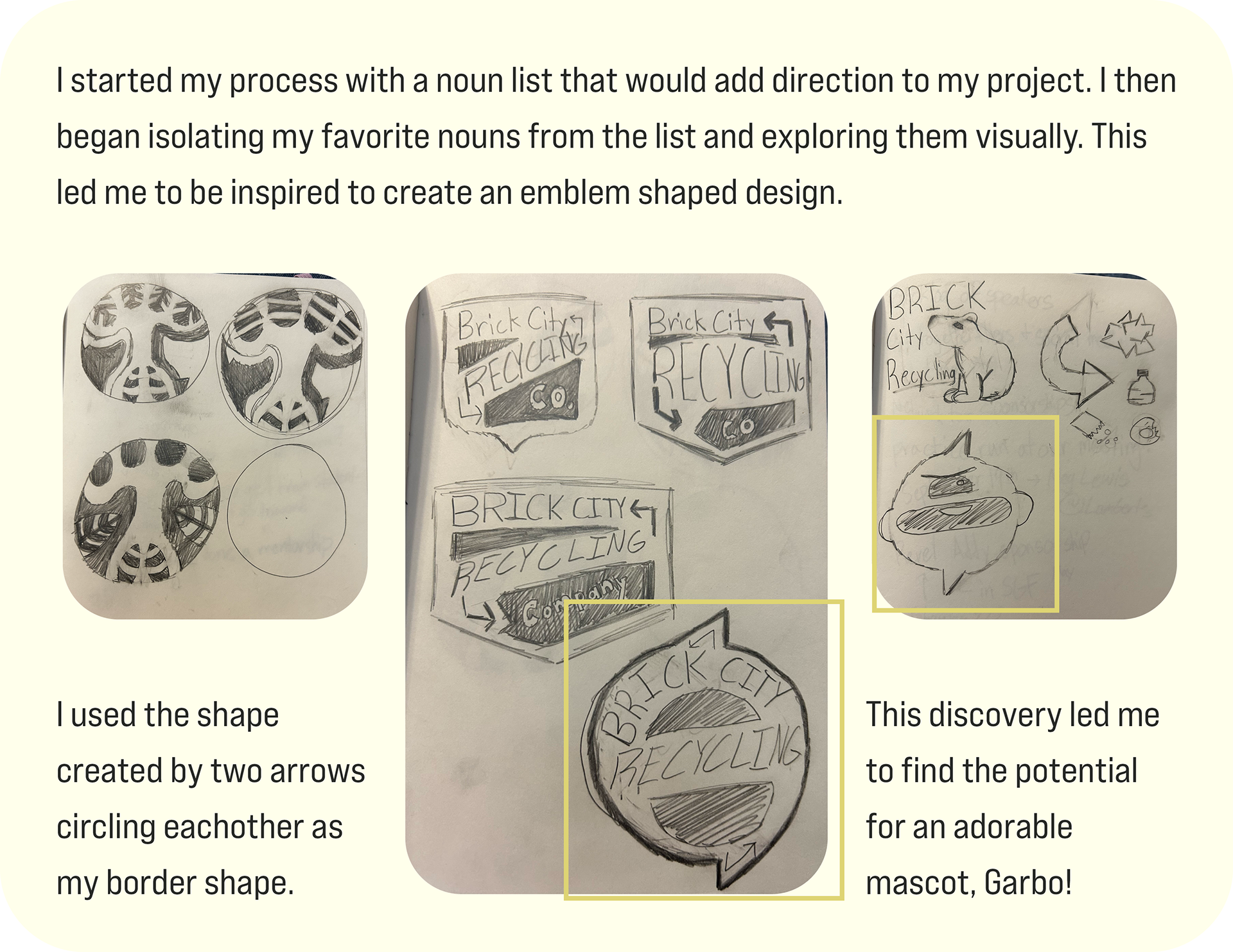
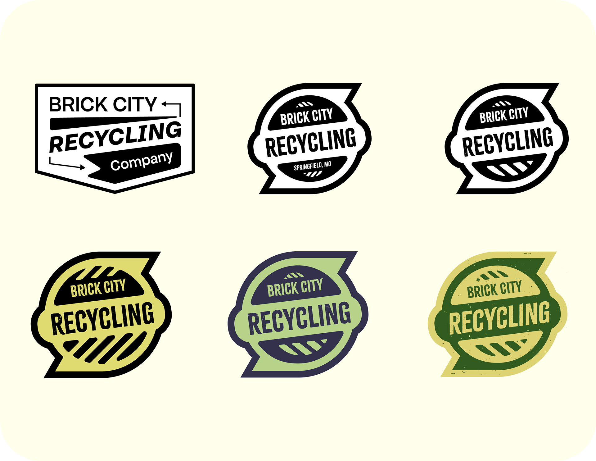
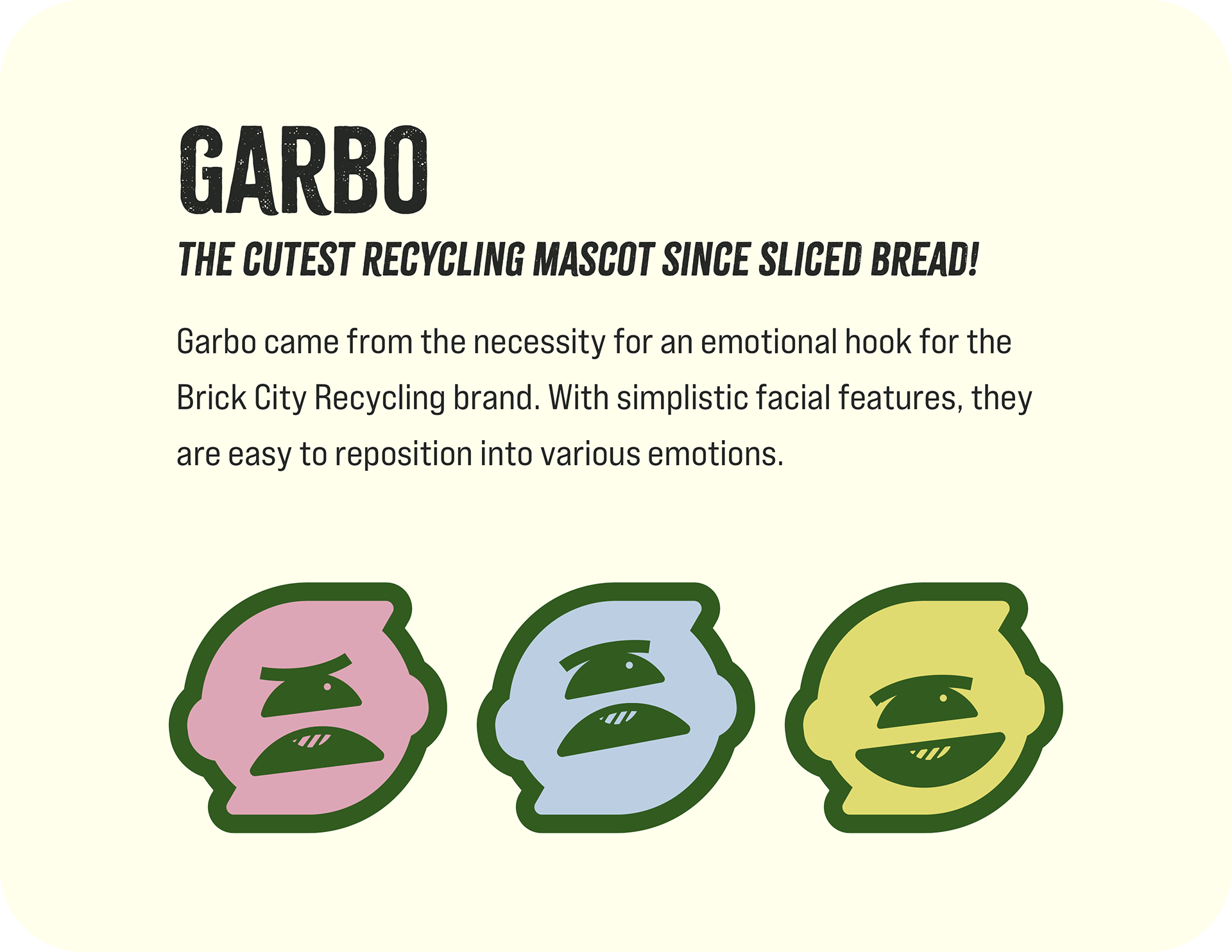
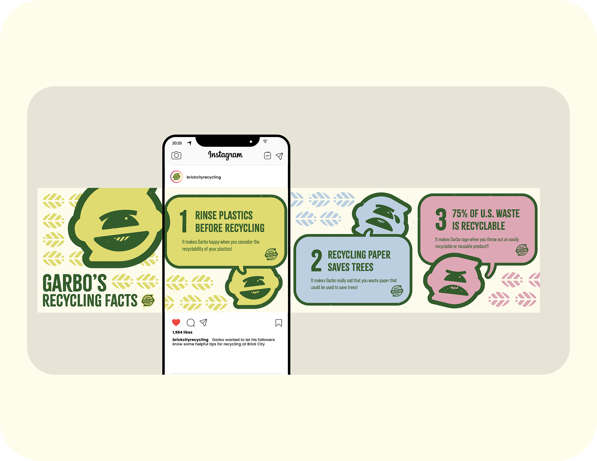
Our building's recycling program needed a refresh. I designed a logo system for Brick City Recycling that relies on crunchy texture awesomeness and a fun animated friend named Garbo. My concept is based on old handwritten signs and emblems within that same vein, but it started out with a tiny list of nouns that I thought accurately represented the brand. This is easily one of my favorite exercises to do. I take a deep breath and free associate for a moment asking myself questions like: "who, what, when, where, and why?" Subsequently these questions lead me to answers.
