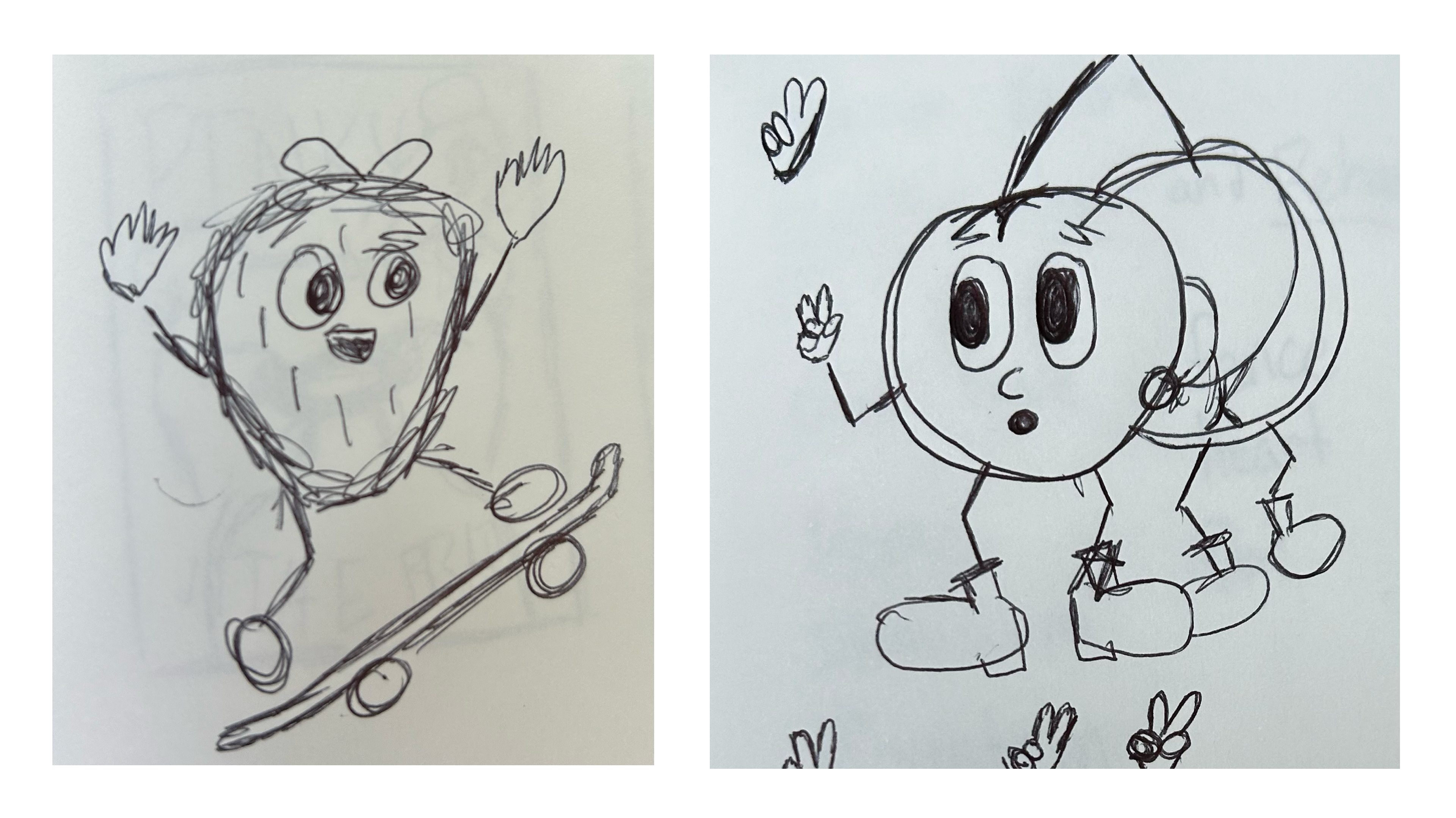
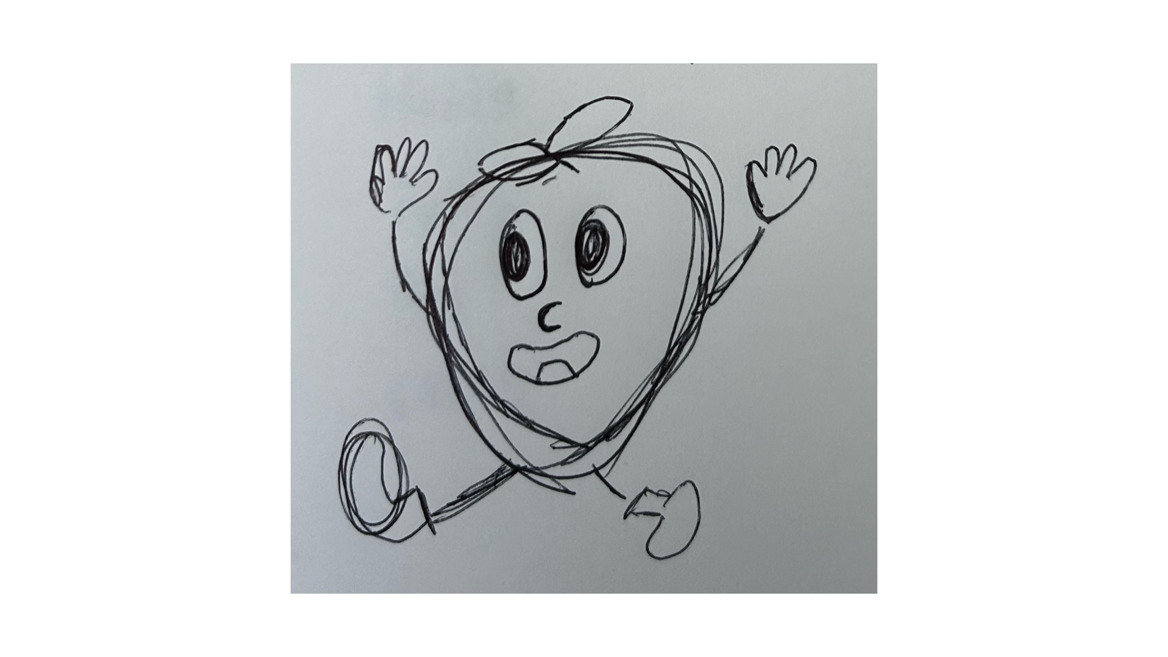
Using Illustrator and previous conceptive art to create a much more energetic and personal design for the pop tarts brand. I took inspiration from rubber house animation and YeYe Weller.
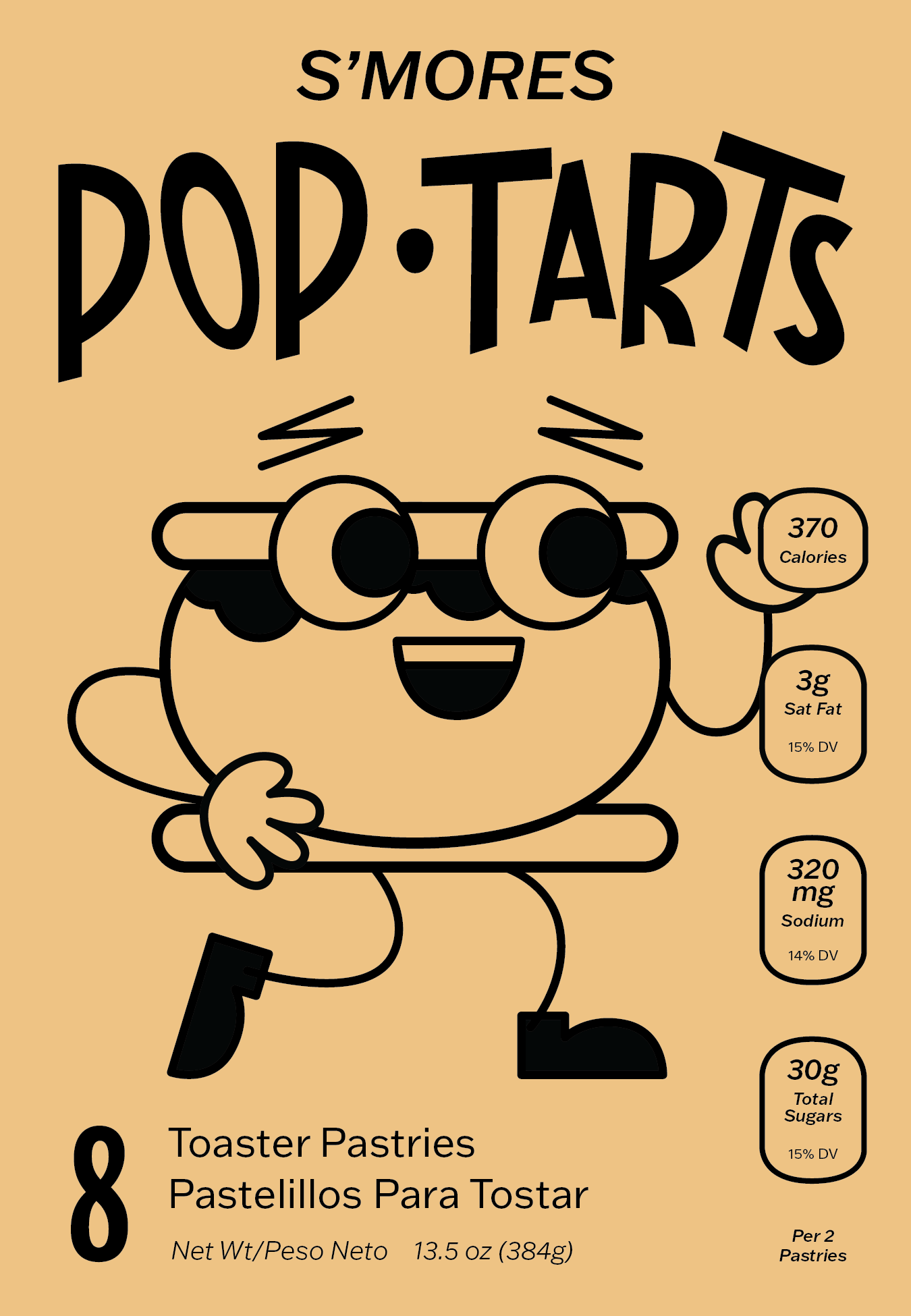
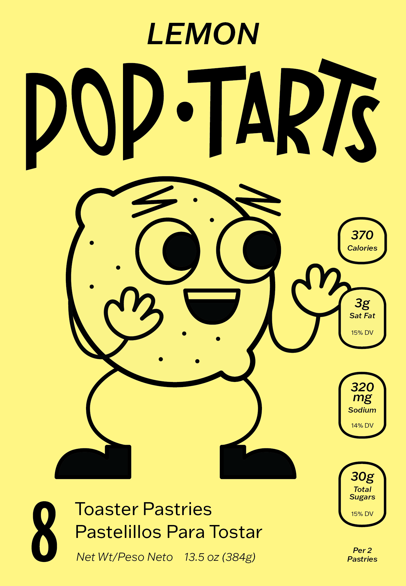
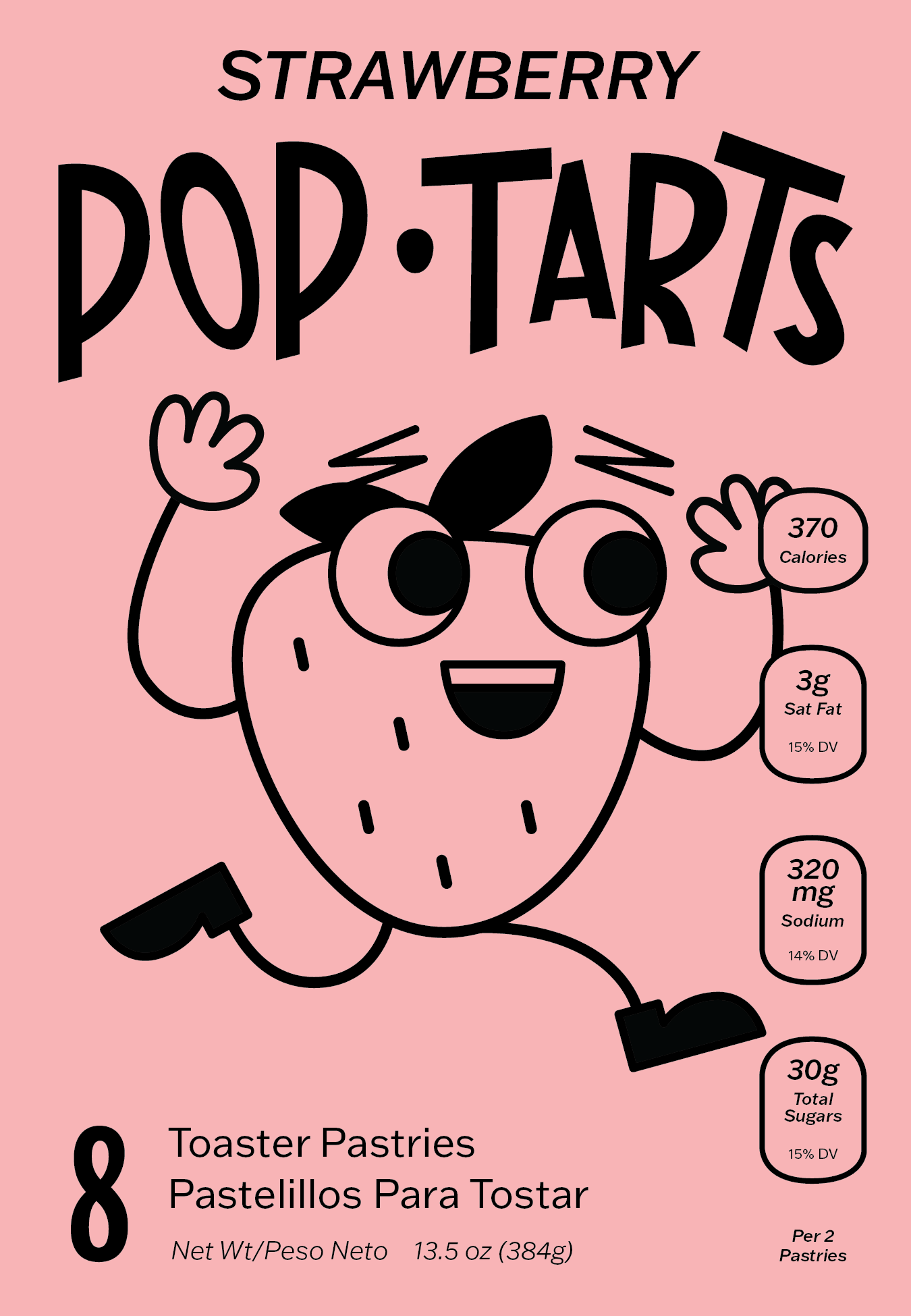
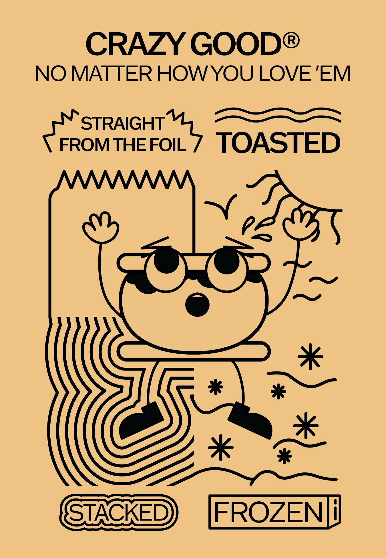
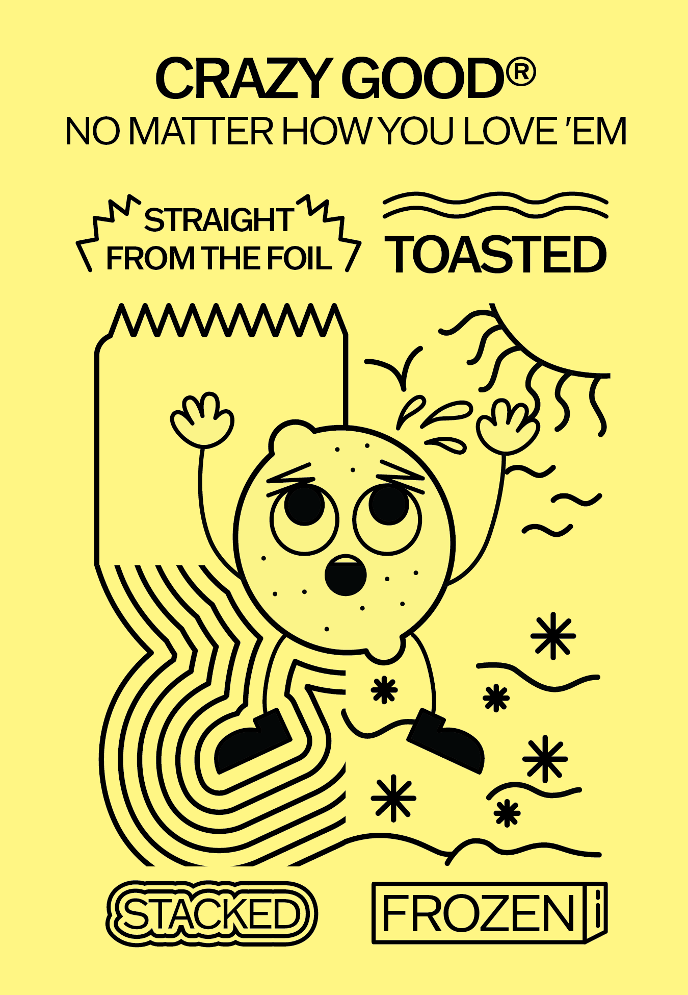
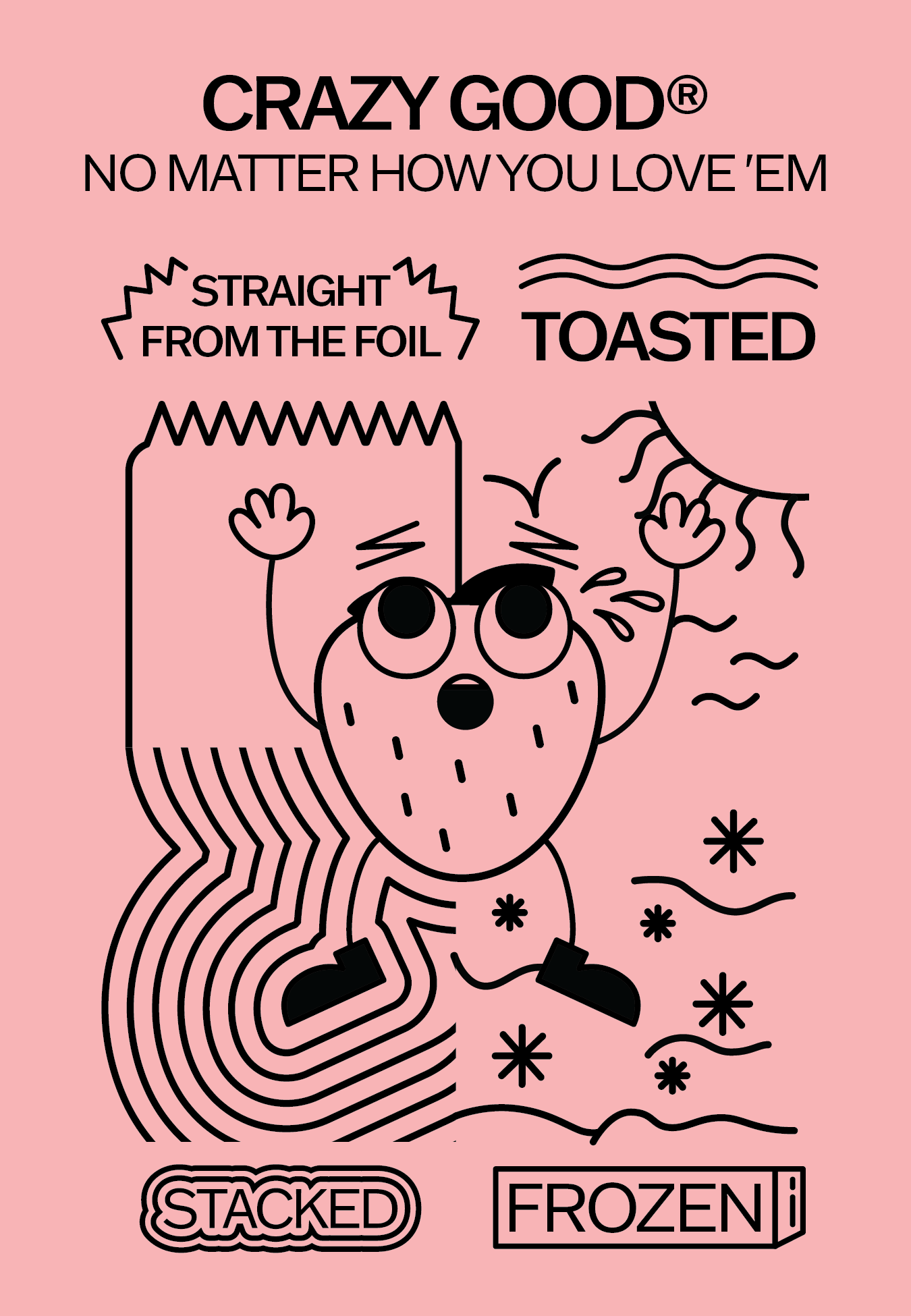
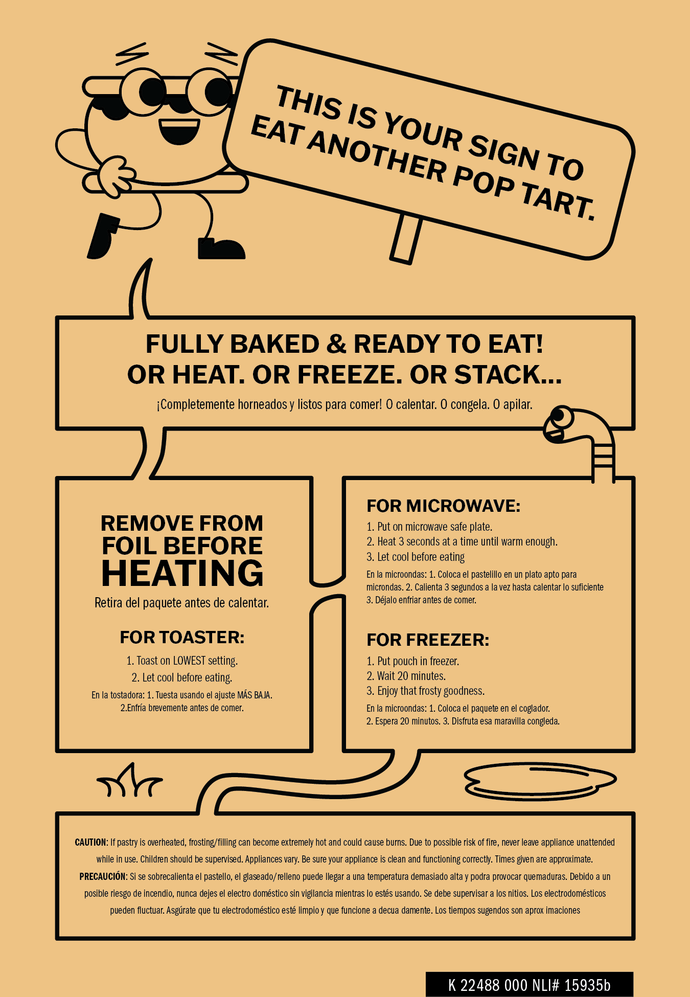
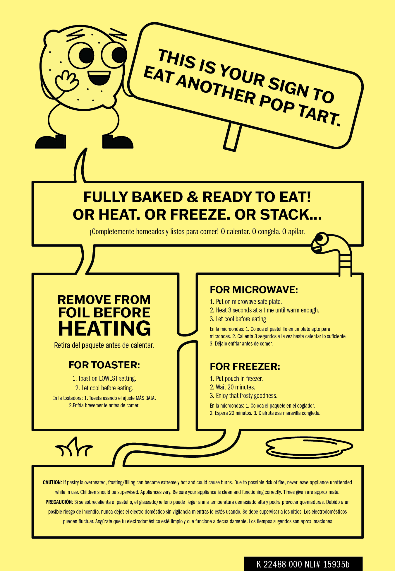
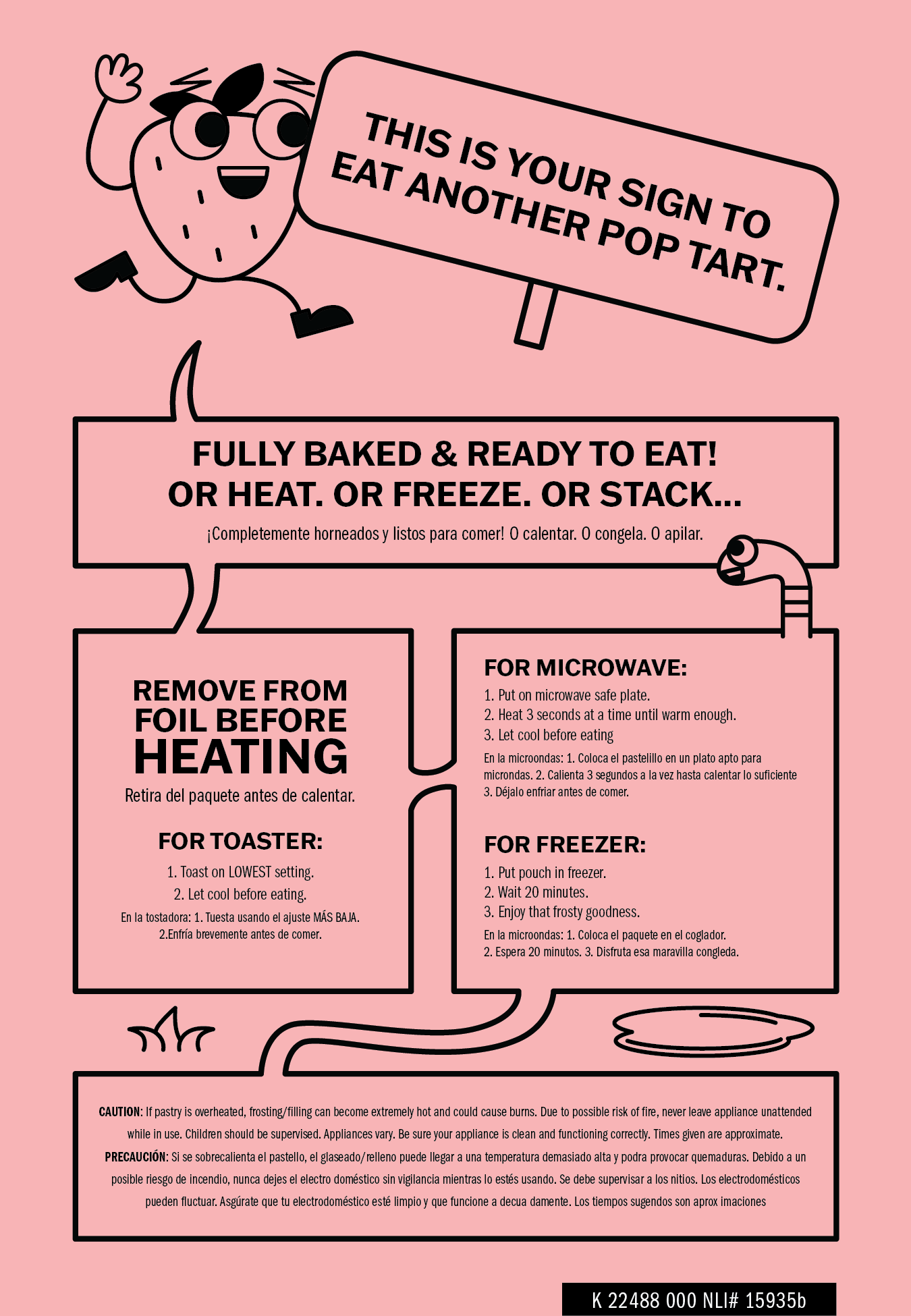
The current state of Pop-Tarts on the shelf is a solid blue wall that does not lend itself to product discovery. This is a problem I solved with the bright, monochrome packaging of my reimagining. It also plays on the convention of characters to relay internal product information.
I saw it needed more of a playful color scheme and package design that is geared less towards realism and more towards exploring an imaginative representation of the product
